From aligning the logo for visual balance to selecting colors and typography that reinforce the brand, these refinements created a stronger, more cohesive presence. Below are a couple of before-and-after transformations.
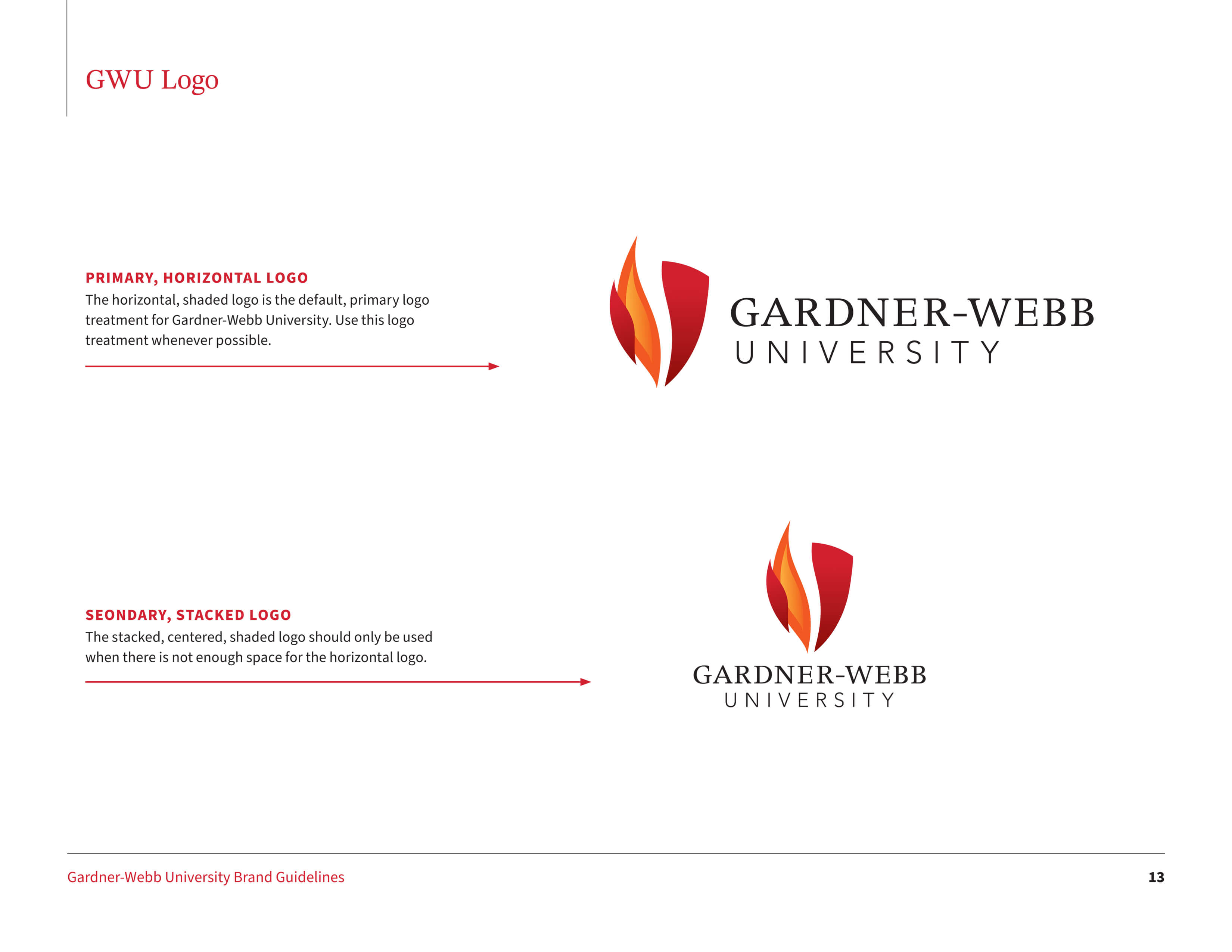
GWU Logo
Align the word 'university' in the horizontal logo, and make this format the primary logo, as it's the one most used.
Typography
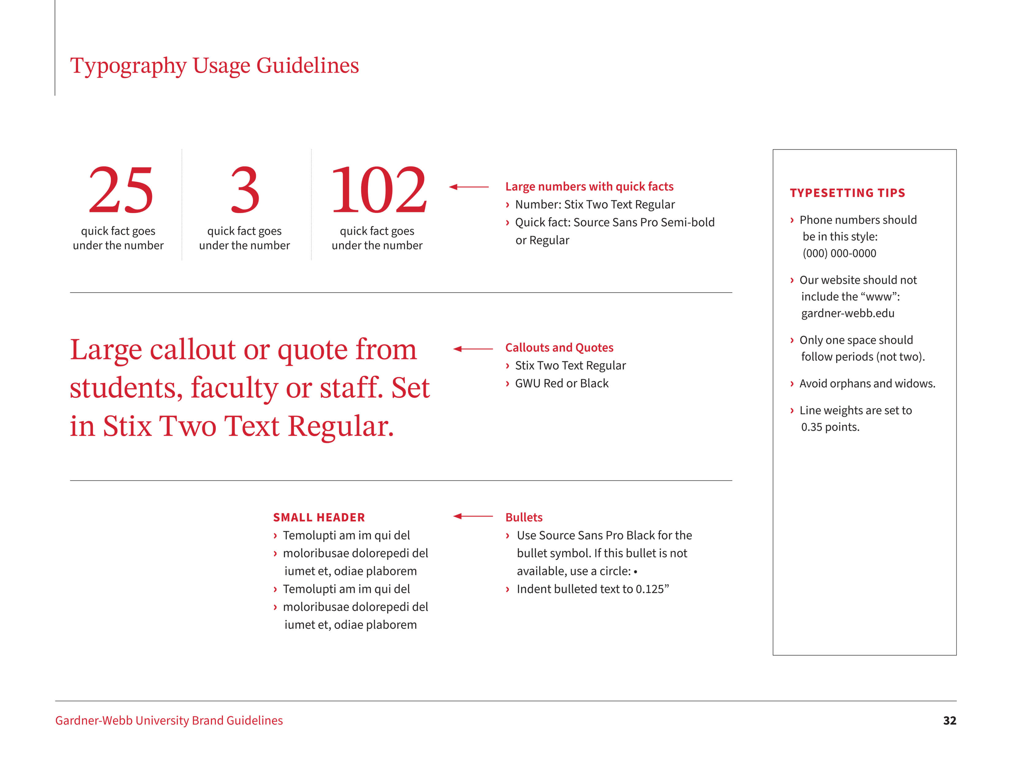
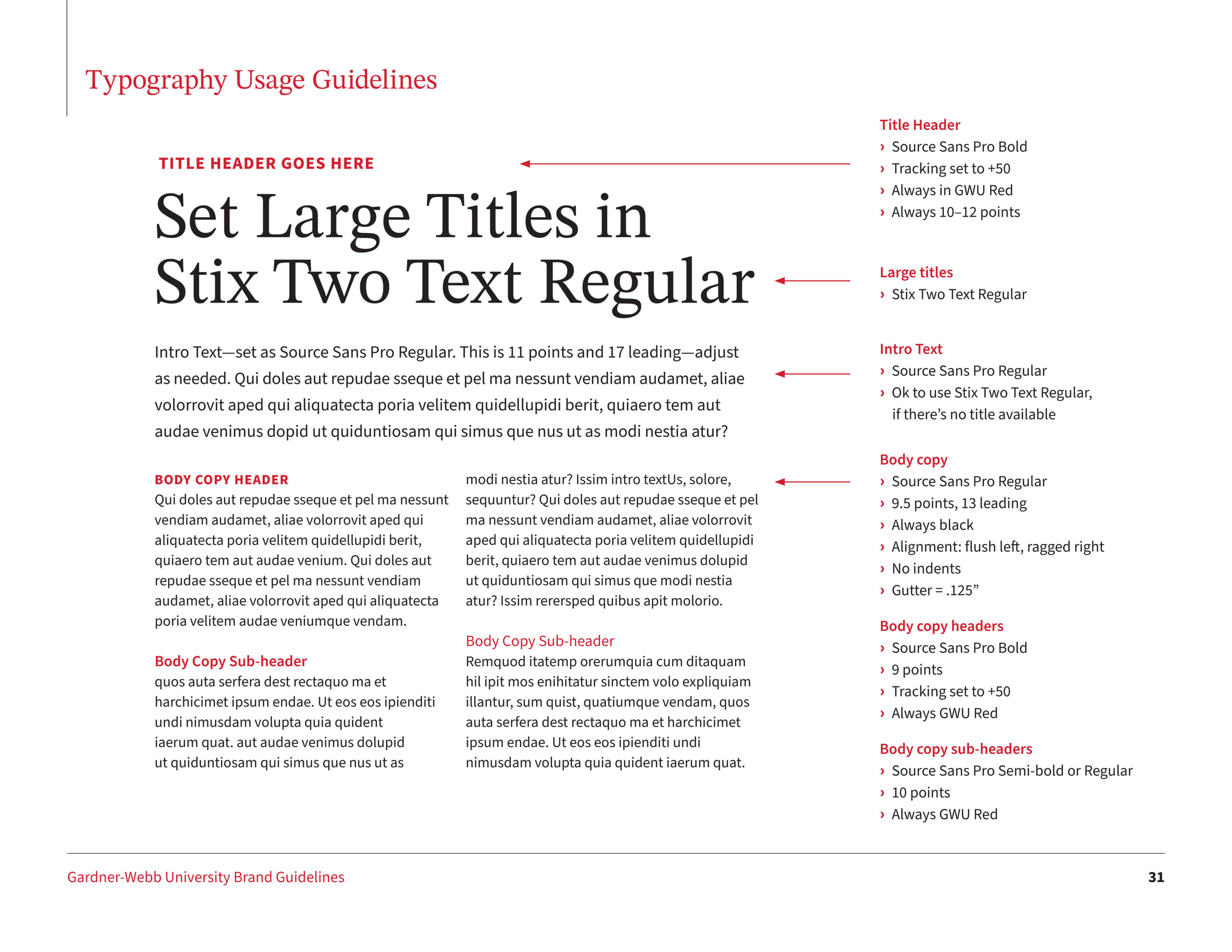
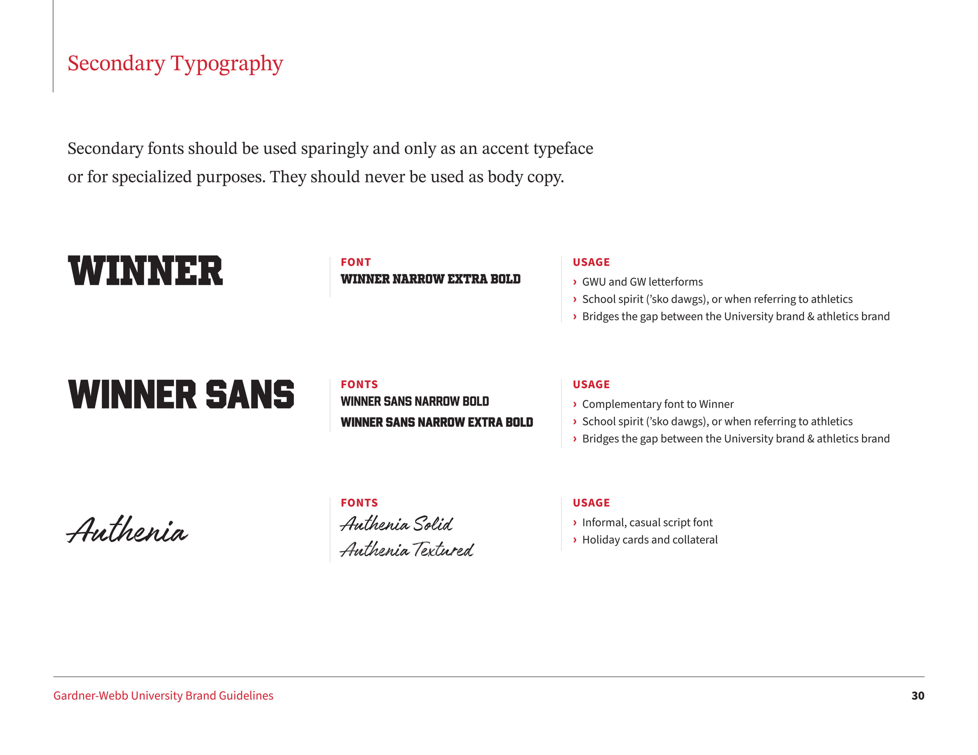
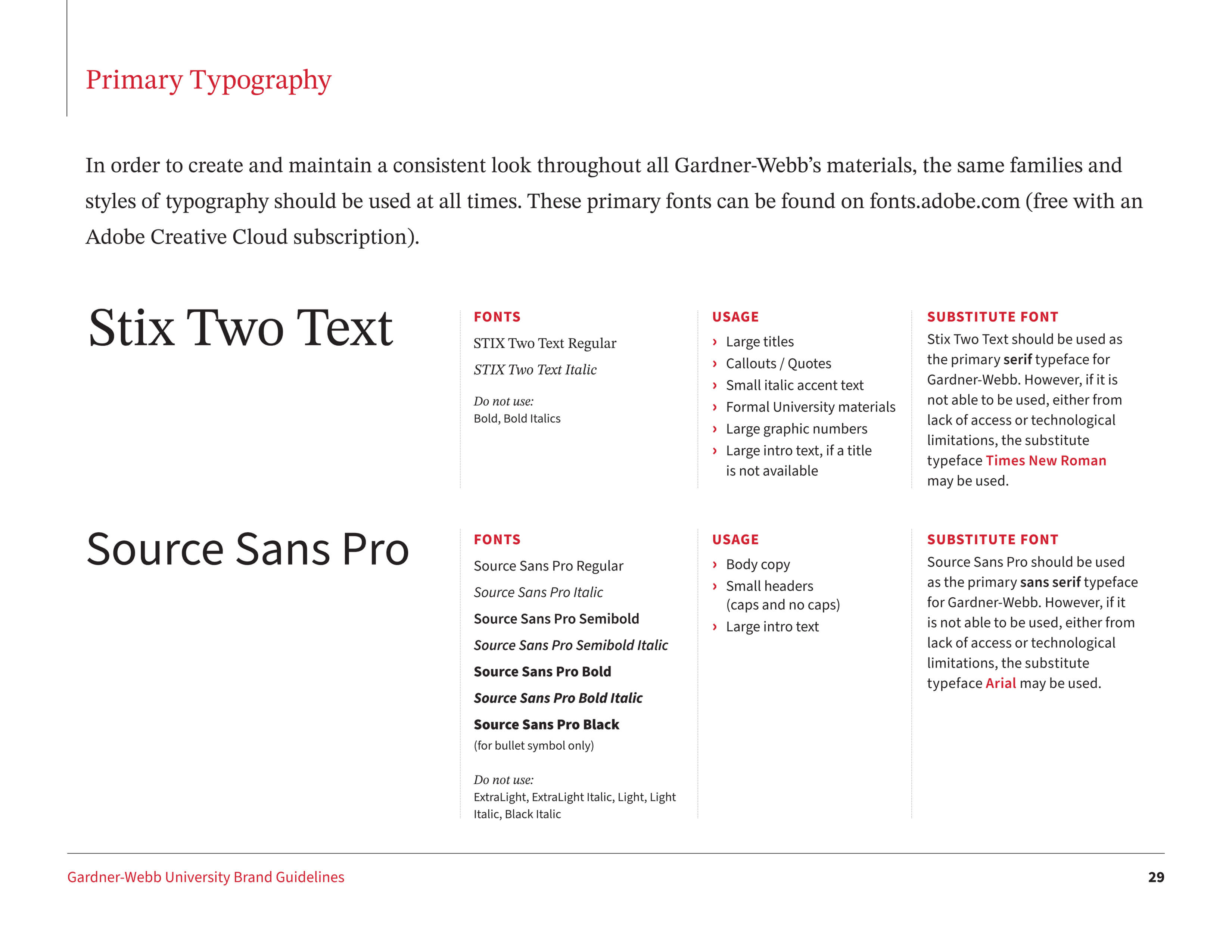
Update the typography in tandem with the new GWU website being designed. Establish clear specifications on typography usage.
Color Palette
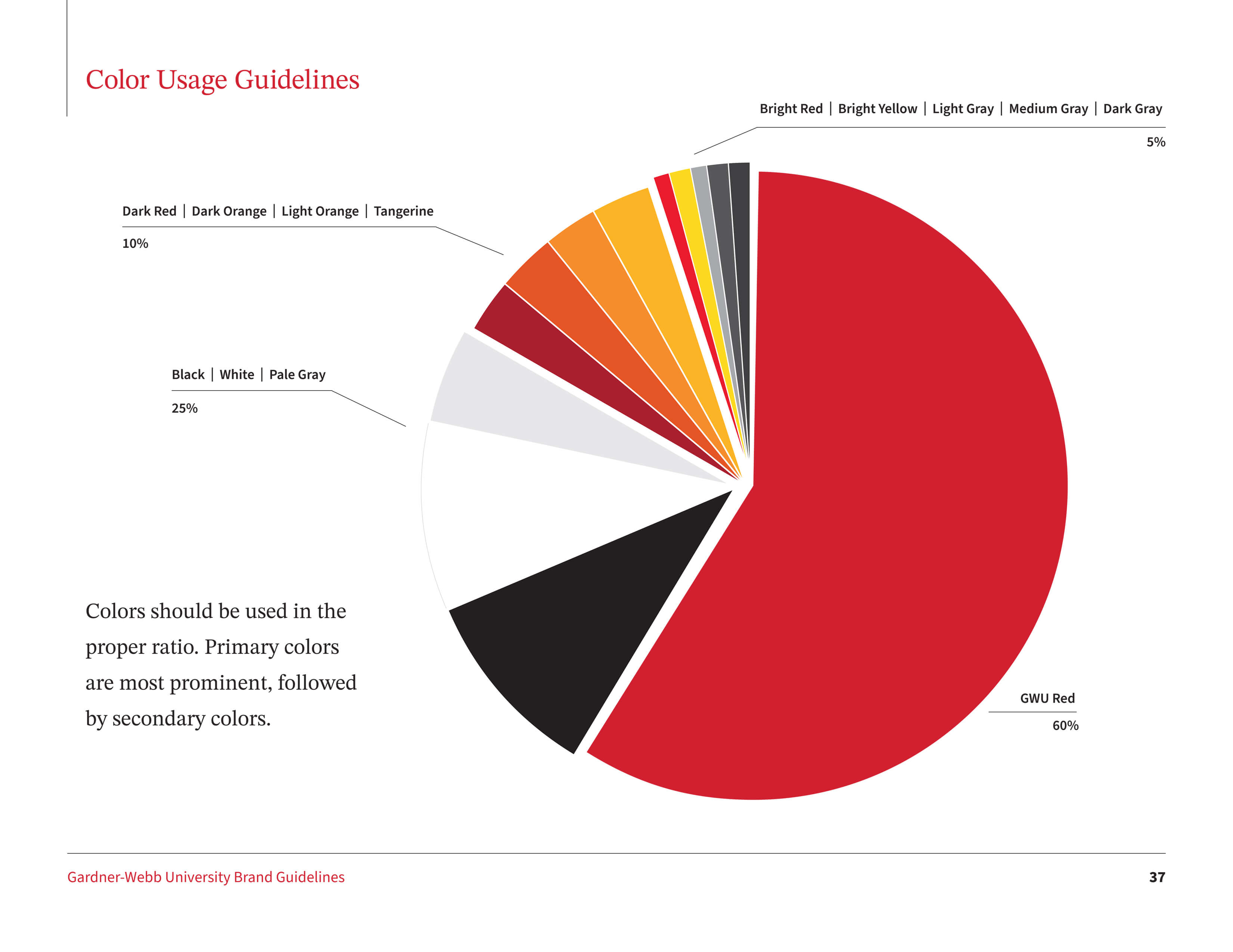
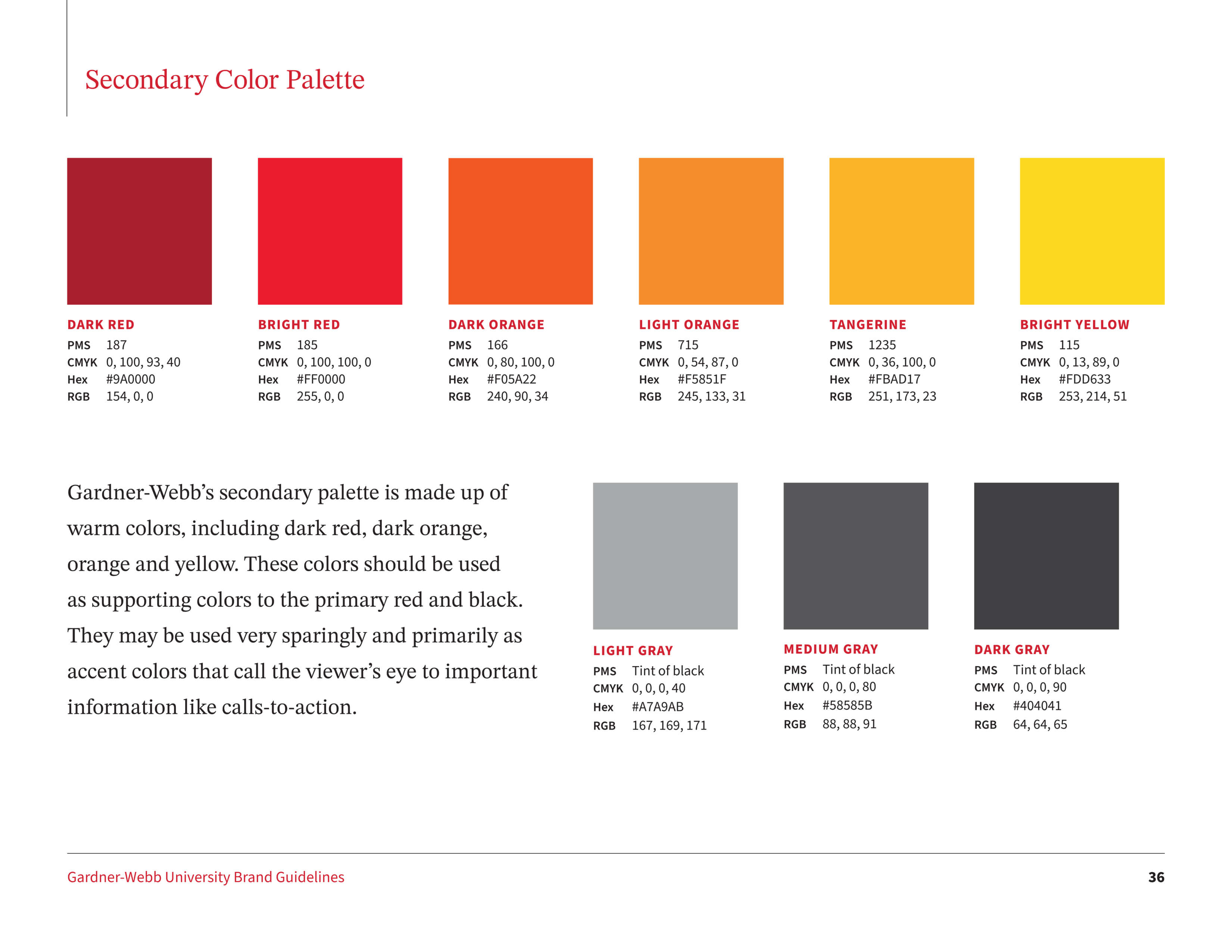
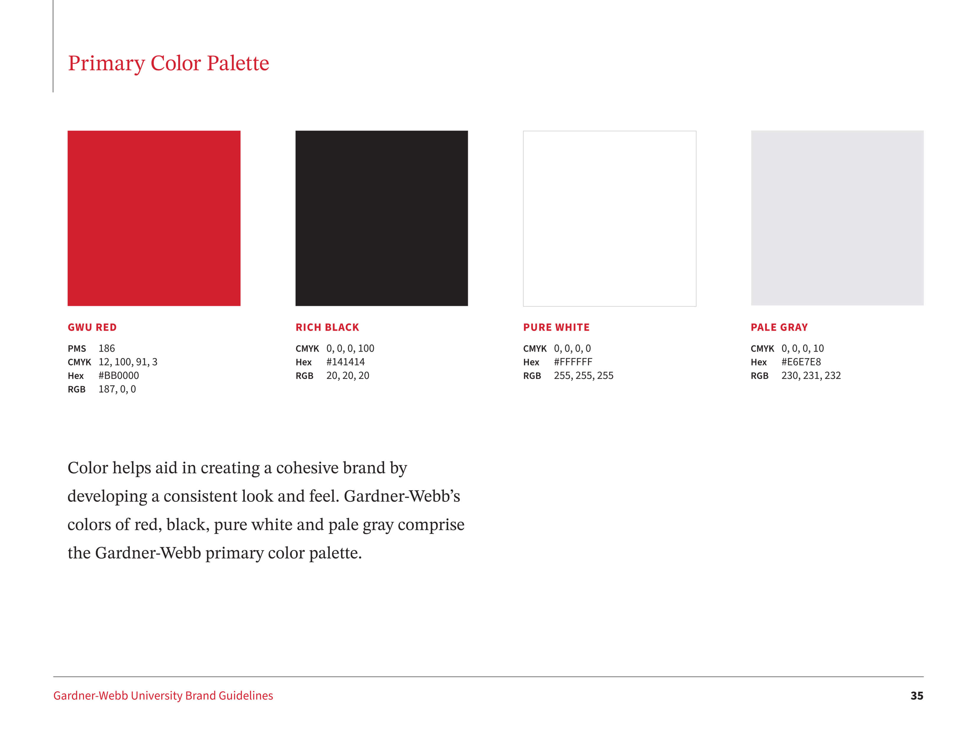
Remove complementary colors and emphasize red (instead of black and red) to create a lighter feel. Add new colors to support the website and digital design.
Bulldog Logo
Include more guidelines about the use of the Athletics' 'Bulldog' logo.
Letterforms
Update the GWU letterforms for use as school spirit graphics.
Super Flame
Remove the 'super flame' graphics, which are outdated and encourage breaking the logo into pieces, which should be avoided.
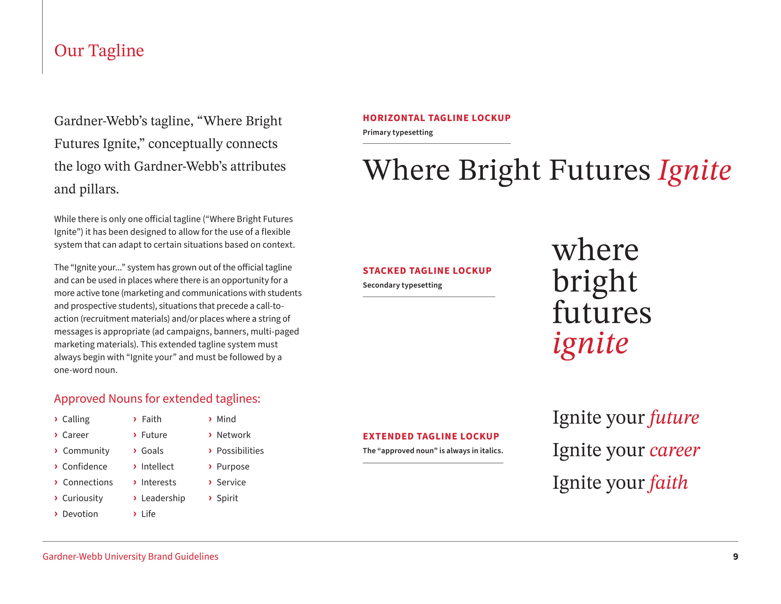
Positioning Statements
Include more details about our brand and define how the University's tagline should be used.
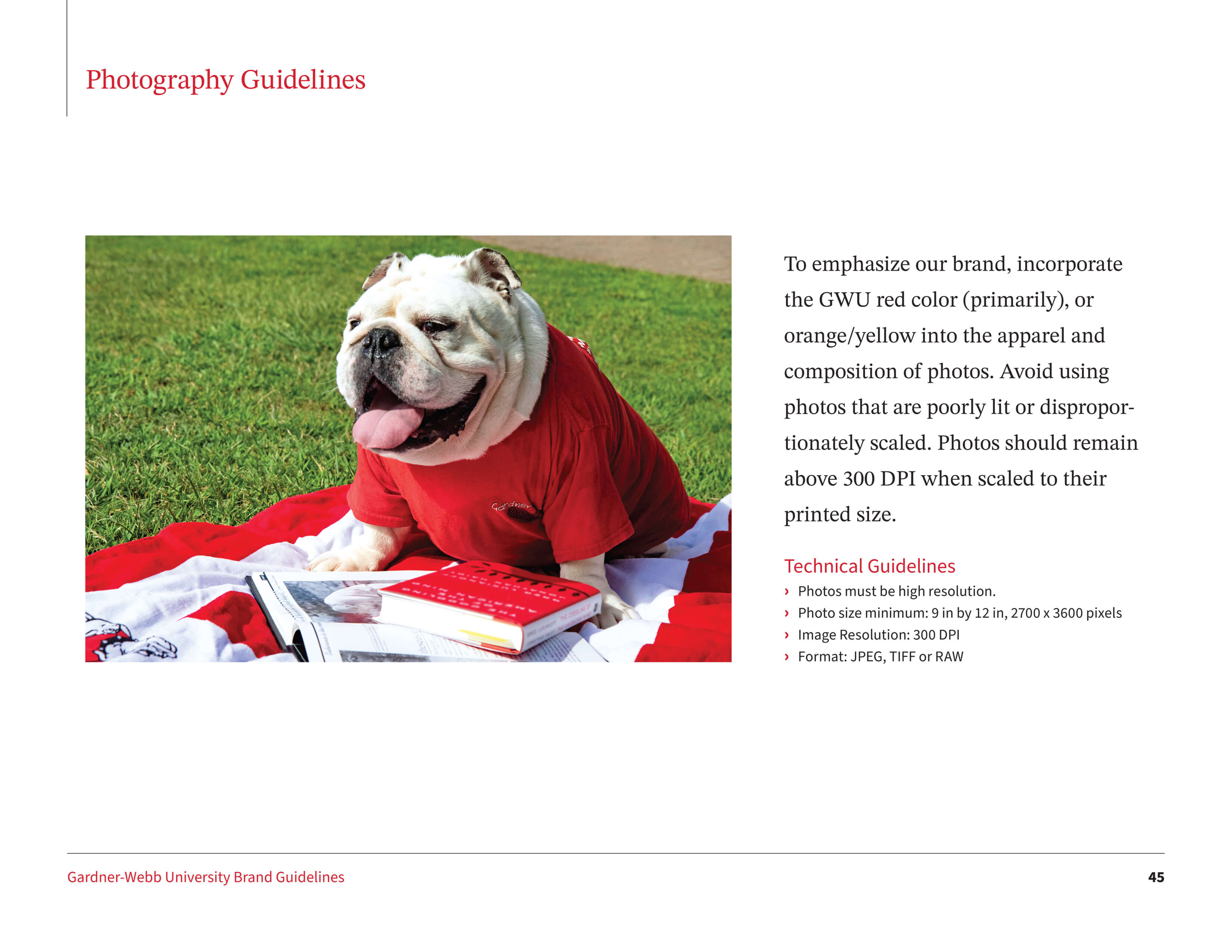
Photography
Create a collection of approved photos for campus community access, and add more details about incorporating the brand in photography.
UNDERSTAND
My first step was to thoroughly understand the existing brand and analyze its strengths, weaknesses, and usage to identify areas for improvement.
Excerpts from the Refreshed Style Guide
Excerpts from the Refreshed Style Guide
1/15
1/15
1/15
1/15
GWU Logo
Align the word 'university' in the horizontal logo, and make this format the primary logo, as it's the one most used.
Typography
Update the typography in tandem with the new GWU website being designed. Establish clear specifications on typography usage.
Color Palette
Remove complementary colors and emphasize red (instead of black and red) to create a lighter feel. Add new colors to support the website and digital design.
Bulldog Logo
Include more guidelines about the use of the Athletics' 'Bulldog' logo.
Positioning Statements
Include more details about our brand and define how the University's tagline should be used.
Letterforms
Update the GWU letterforms for use as school spirit graphics.
Super Flame
Remove the 'super flame' graphics, which are outdated and encourage breaking the logo into pieces, which should be avoided.
Photography
Create a collection of approved photos for campus community access, and add more details about incorporating the brand in photography.
Before
After
Alignment of the word 'University' in the logo
Before
After
PMS 187
PMS 185
PMS 166
PMS 715
PMS 1235
PMS 115
Light Blue
Dark Blue
Light Purple
Dark Purple
Warmer secondary colors were selected to support the brand and new website
Light Blue
Dark Blue
Light Purple
Dark Purple
PMS 187
PMS 185
PMS 166
PMS 715
PMS 1235
PMS 115
Overview
I led a strategic brand refresh for Gardner-Webb University, modernizing the visual identity, clarifying brand architecture, updating brand guidelines, and debuting the refresh alongside the University's new website. This cohesive rollout strengthened the University's presence and ensured brand consistency across channels.
The words 'Gardner-Webb' and 'University' were not visually aligned in the horizontal logo. Make the horizontal logo to the primary logo, as it's the one most used.
Typography
Update the typography in tandem with the new GWU website being designed. Establish clear specifications on typography usage.
Color Palette
Remove complementary colors and emphasize the color red (instead of black and red) to create a lighter feel. Add new colors to support the website and digital design.
Bulldog Logo
Include more guidelines about the use of the Athletics' 'Bulldog' logo.
Letterforms
Update the GWU letterforms for use as school spirit graphics.
Positioning Statements
Include more details about our brand and define how the University's tagline should be used.
Super Flame
Remove the 'super flame' graphics, which were outdated and encouraged breaking the logo into pieces, which I wanted to avoid.
Photography
Create a collection of approved photos for campus community access, and add more details about incorporating the brand in photography.
After making thoughtful brand decisions, conducting competitive analysis, and gathering feedback from key stakeholders, I designed a new style guide as both a PDF and a dedicated section on the Gardner-Webb website.
I contributed to the creative direction of the University’s new website, providing design guidance and ensuring a cohesive brand experience. While a firm handled the full design and research process, I collaborated closely with them to maintain brand integrity. I launched the refreshed brand alongside the website debut, strengthening Gardner-Webb's identity.
APPLICATION
My team and I applied the refreshed brand across various design projects. Our work gained increasing recognition on campus for its strong visual impact and effectiveness. A few examples are below.
Letterforms
Update the GWU letterforms for use as school spirit graphics.
Positioning Statements
Include more details about our brand and define how the University's tagline should be used.
Super Flame
Remove the 'super flame' graphics, which are outdated and encourage breaking the logo into pieces, which should be avoided.
Photography
Create a collection of approved photos for campus community access, and add more details about incorporating the brand in photography.