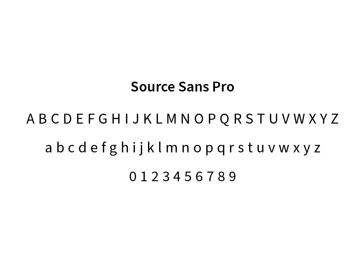
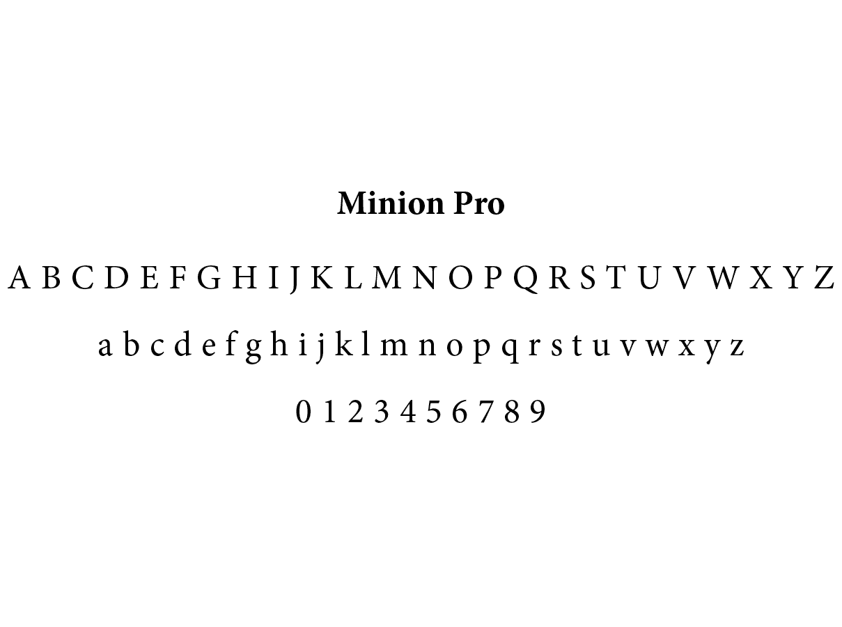
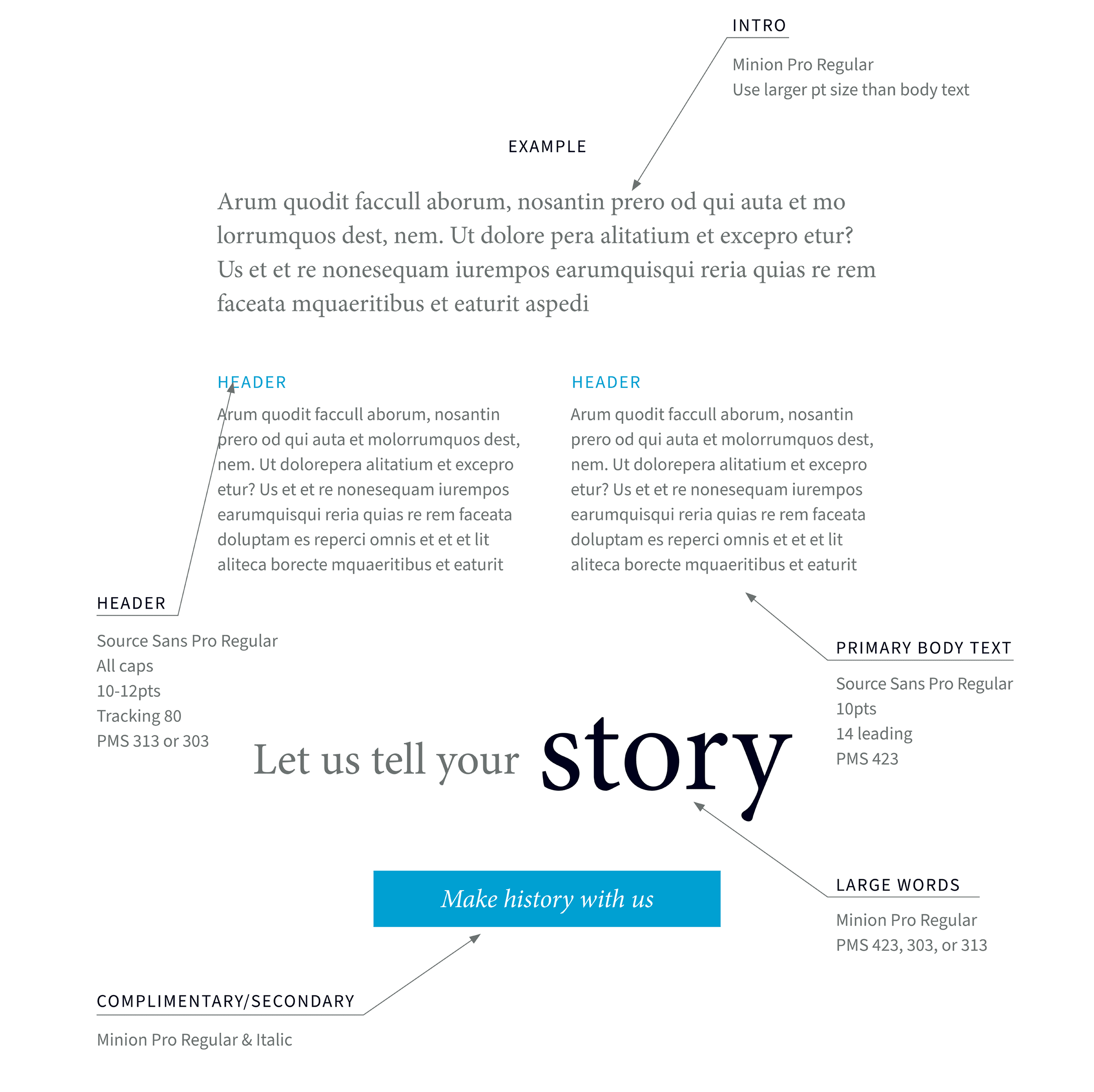
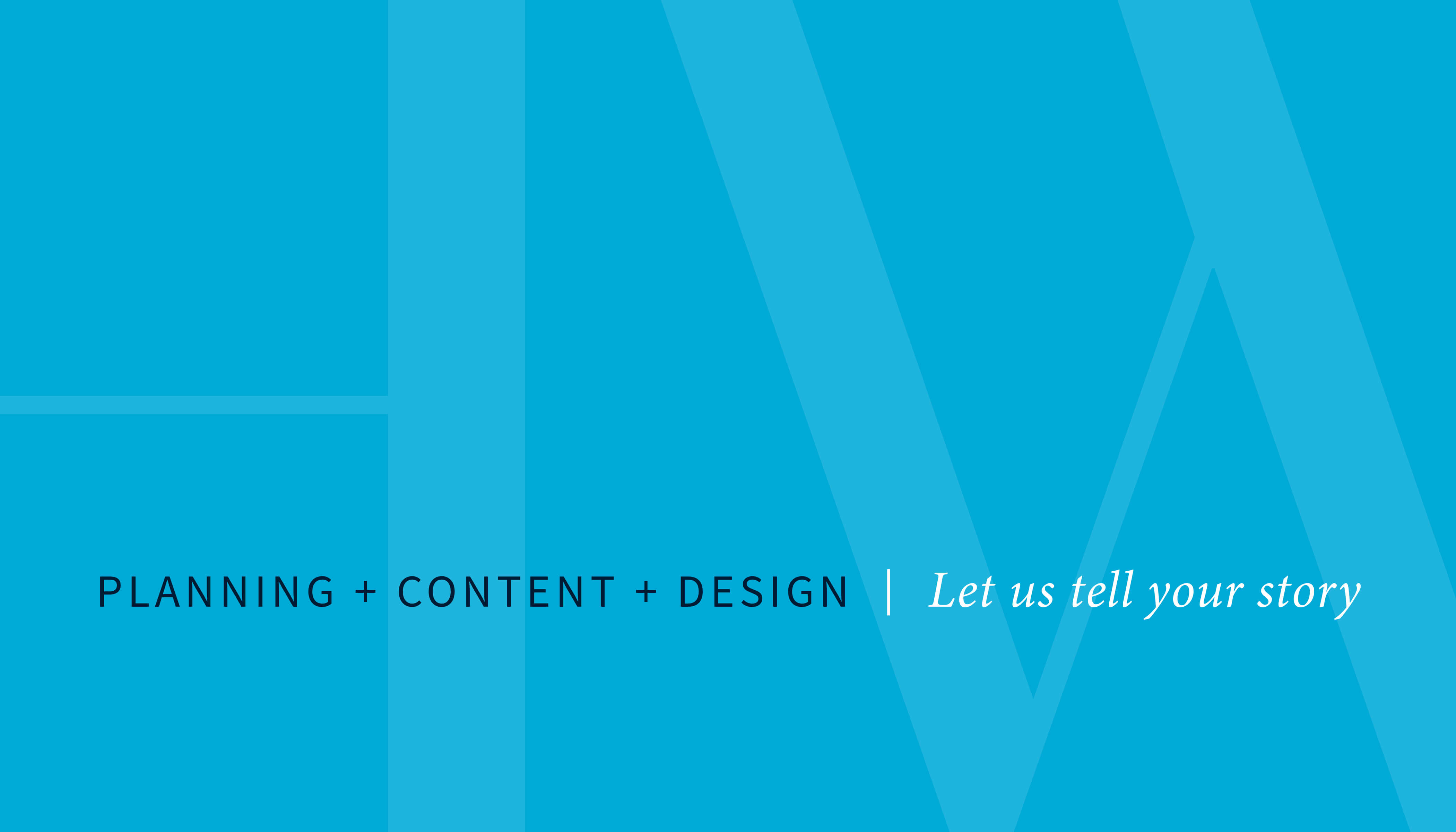
The typography was simple to allow our exhibit work to stand out (the exhibit work contained unique fonts).
history of the brand name
The founder of Brockington and Associates, our parent company, explained that the word "workshop" was selected for The History Workshop to indicate that we were history and science experts who focused on the needs of smaller agency and private sector clients. We decided it was time to update our name to reflect our current work, since we were more than a small "workshop."
Rebranding The History Workshop
Rebrand The History Workshop to strengthen the brand and to create a consistent look and feel for all collateral.
Senior Designer, Led the rebranding
HW Exhibits, Brockington and Associates
The History Workshop Team
Once the team had defined some core brand beliefs and we were in agreement with the overall direction, I moved forward with developing the brand.
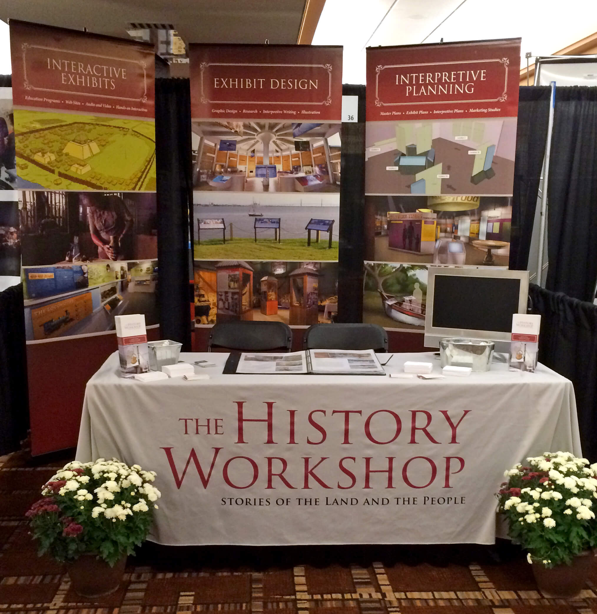
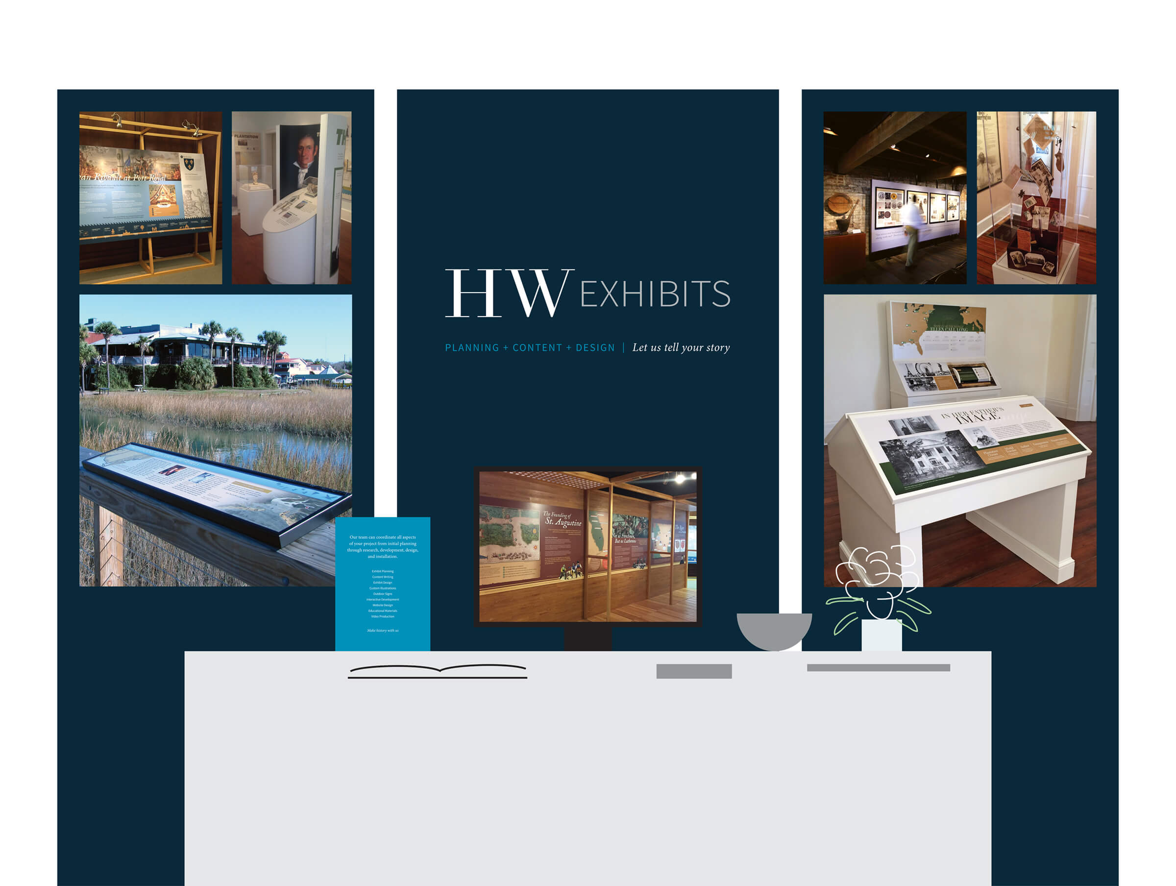
The new brand was warmly received by social media, our clients, and our colleagues at Brockington. A particularly memorable moment occurred while we were setting up our booth at an annual conference. A competitor, who rarely interacted with us, walked over, stared at our booth without making eye contact, and said, "That looks good," before walking away. Within a few months, this competitor began a brand refresh. We took that as a compliment. Additionally, at the conference, numerous attendees stopped in their tracks to comment on how impressive our booth looked. My strategy had succeeded—in a sea of cluttered displays, our clean, minimal design stood out, attracting attention and encouraging engagement with people who might have otherwise passed us by.
My first step was to clearly understand the current issues with our brand, so a stronger design could be implemented. The existing brand was named, "The History Workshop."
Existing Brand Problems with "The History Workshop"
Existing Brand Problems with "The History Workshop"
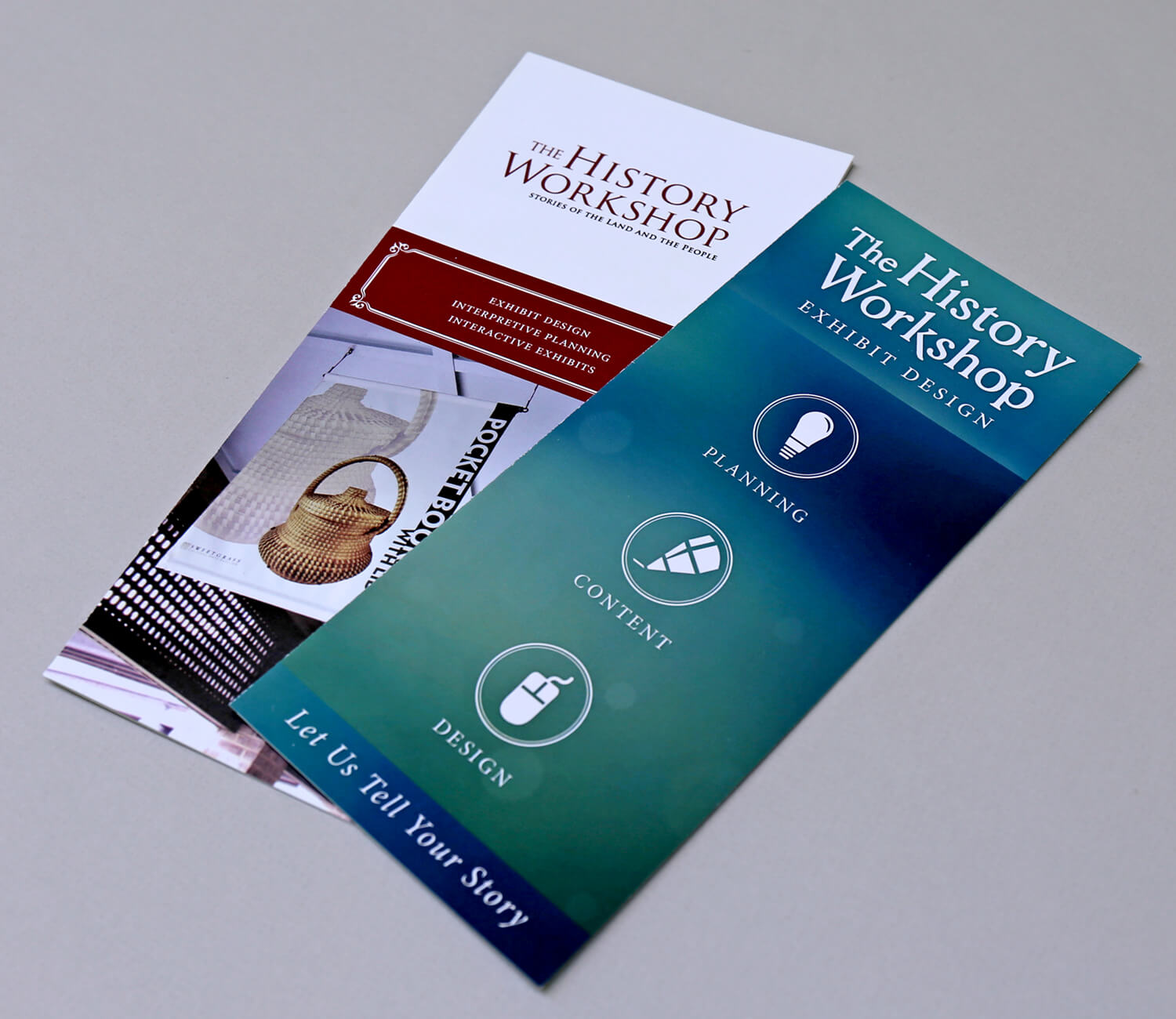
The brand had two different visual representations.
"The History Workshop" didn't describe the work being produced and there were two businesses with similar names.
Our brand didn't match the quality of work we were producing or personality.
The tie to our parent company, Brockington and Associates, wasn't strong enough.
It wasn't clear exactly what we do (to those who don't know us). Clarify who we are and what we do.
Our audience needed to be more clearly defined.
I performed a competitive analysis to better understand our closest competitors. I also partnered with a colleague to create and distribute surveys about our brand.
I compiled all the research and led our team through brand discussions, brainstorming sessions and exercises, which helped us define our new brand.
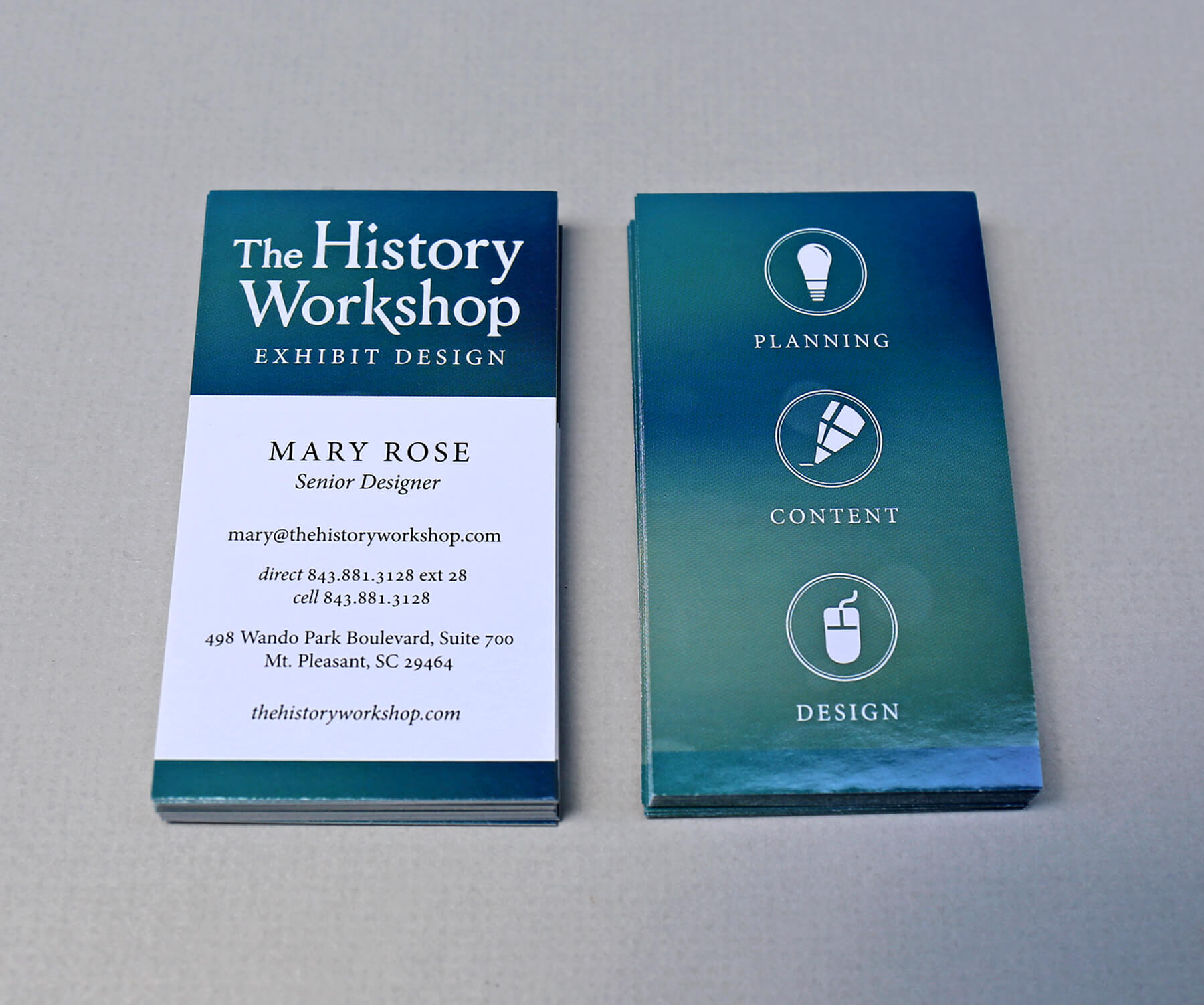
Existing Mismatched Brand Collateral
Existing Mismatched Brand Collateral
I reviewed our closest competitors, as well as a few larger exhibit firms for comparison (C&G Partners, Gallagher and Associates, Applebaum Associates). I analyzed how they presented themselves visually, their messaging, and their marketing.
Malone Design
and Fabrication
My colleague and I sent surveys to our current and past clients, and to our parent company, Brockington and Associates. We also posted the survey on social media. The questions were multiple choice and open-ended.
I developed a rebranding proposal that required approval from our parent company, Brockington and Associates. In the proposal, I detailed the steps necessary to create a stronger brand identity, ultimately enhancing our ability to attract more clients.
Proposed Elements for Rebranding
Proposed Elements for Rebranding
We needed a new logo (and name), mission statement, vision statement, values statement, tagline, brand promise and style guide.
T-shirts and lapel pins were needed for installs, business cards, brochures, printed portfolio, letterhead, a conference booth and conference giveaways.
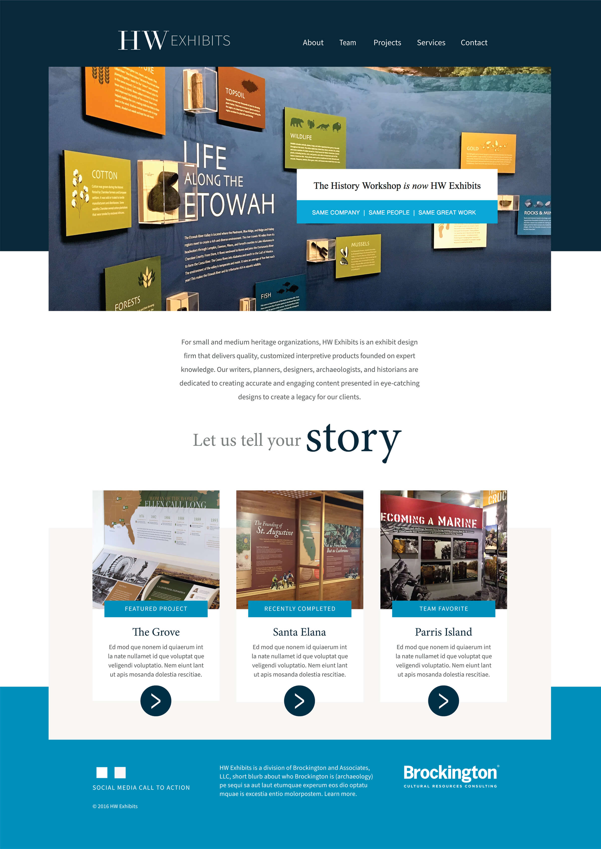
A new website, social media strategy, and a PowerPoint presentation of our work were needed.
Send a mailer and email blast to our clients about our new brand and make social media announcements.
We needed new front door signage and some interior environmental branding.
From an internal perspective, we needed templates (for proposals, floor plans, renderings, estimate request forms, etc.).
Sample Interview Questions
What does The History Workshop do?
How would you describe the personality of The History Workshop?
Does The History Workshop deliver on what it promises?
Vision, mission, and positioning statements
Brand promise, personality, and identity
SWOT analysis of our brand and business
Show and Tell:
Brands that inspire us
Competitive analysis and survey results
Assessment of our existing brand and ideas for our new brand
Selecting a new name and ensuring we had a URL for the new name was a challenging process. We landed on HW Exhibits as our new name. The HW is short for History Workshop. We realized we were already calling ourselves HW prior to this transition and it's a nice way to honor our original name. We included the word "exhibits" in our name to make our purpose more clear.
The color palette is elegant, sophisticated, friendly, approachable, and pays an homage to the coastal colors of the Charleston, SC Lowcountry.
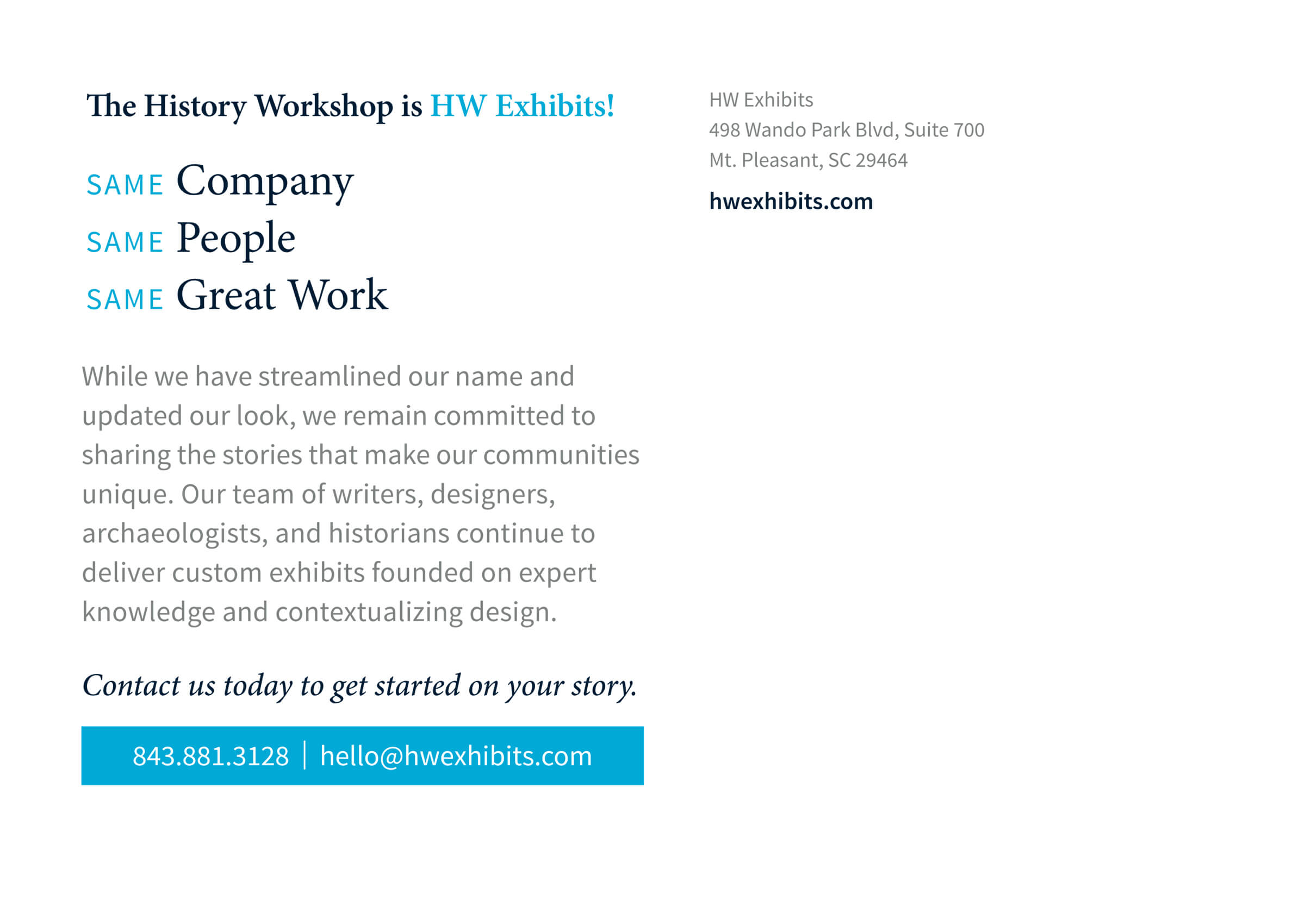
When we launched the new brand, we sent postcards and emails to our audience and made posts on social media. Our slogan was: Same company. Same people. Same great work.
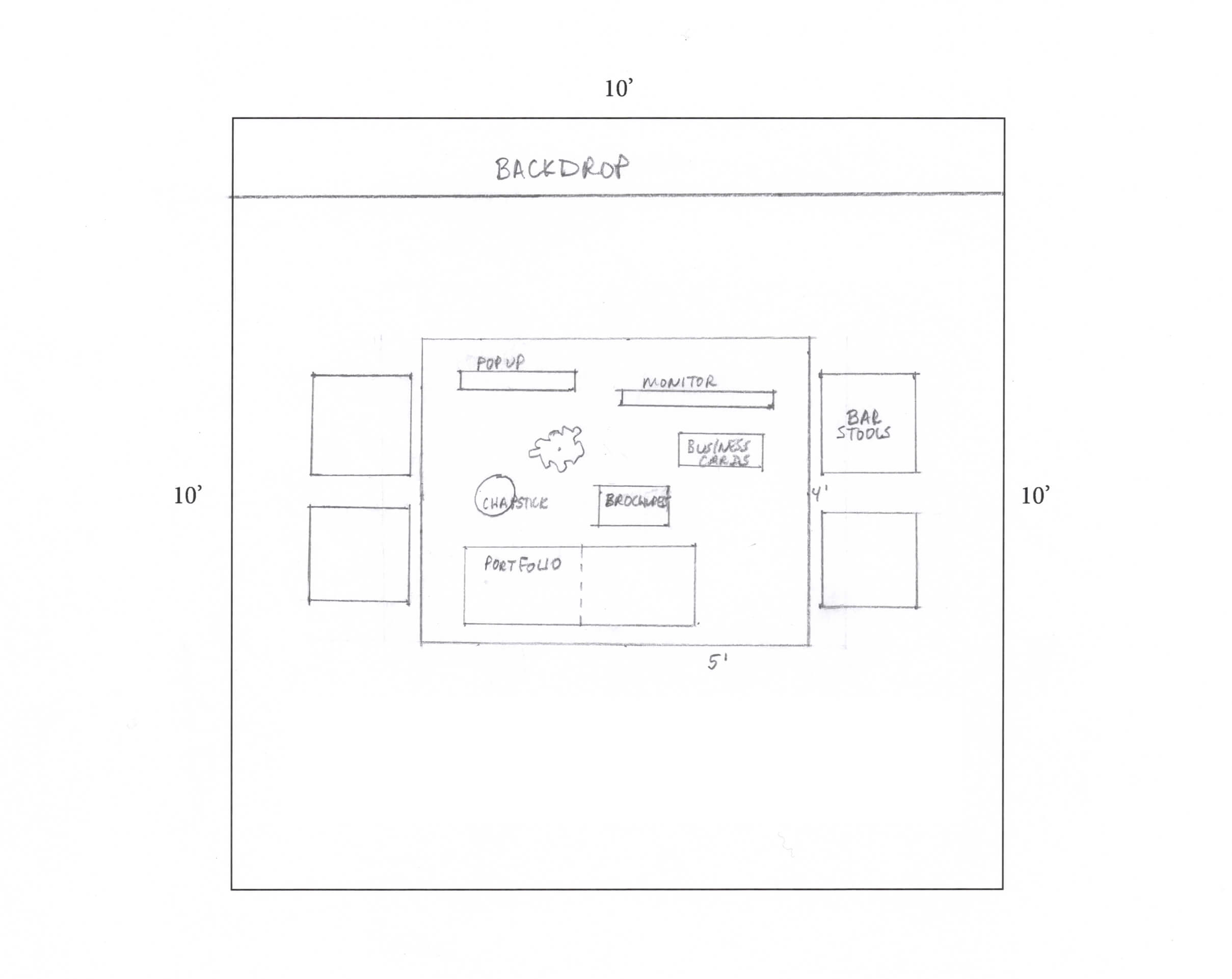
Initial Idea — Booth Floor Plan
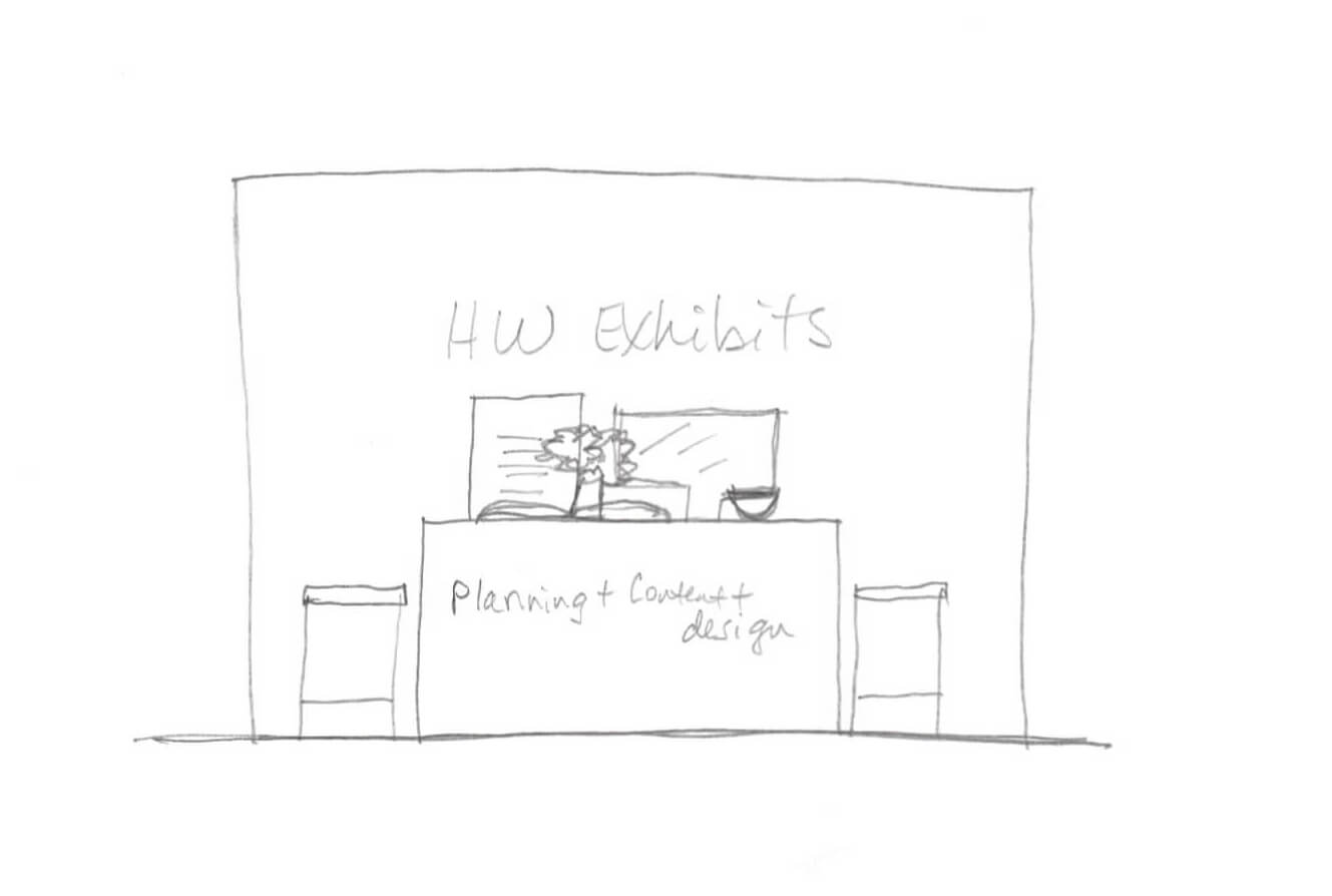
Initial Idea — Quick Elevation Sketch
Some participants did not realize we made custom millwork for exhibits.
of participants described us as friendly.
A small percentage of participants thought we did interior design, which we did not.
of participants heard about The History Workshop through word of mouth.
Many participants liked our local connection—producing strong, relevant work for the community.
of participants "strongly agreed" that we deliver on what we promise.
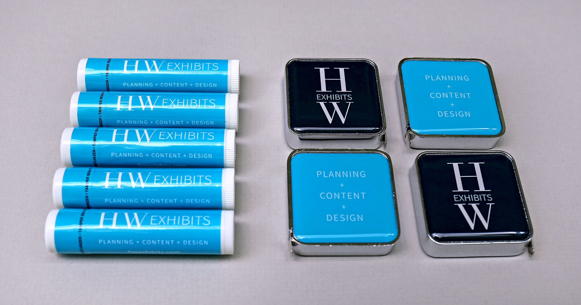
Lip Balm and Measuring Tapes (Giveaways)
Lip Balm and Measuring Tapes
I created a brochure, business cards, a conference booth and giveaways, a website, door signage, several brand launch announcements, and internal branded design templates.
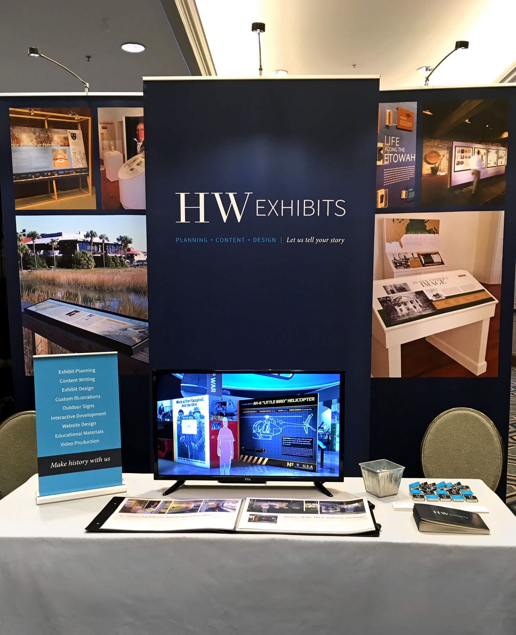
My initial design featured a custom bar-height table with stools, allowing us—and the monitor showcasing our work—to be at eye level with attendees. A solid dark blue backdrop with our logo was planned to create a clean, minimal design that would stand out amidst the crowded conference. However, due to budget constraints, I opted for a less customized design.
Revised, Budget-friendly Mockup
Initial Idea — Booth Floor Plan
Initial Idea — Quick Elevation Sketch
What does The History Workshop do?
How would you describe the personality of The History Workshop?
Does The History Workshop deliver on what it promises?
Malone Design and Fabrication
What does The History Workshop do?
How would you describe the personality of The History Workshop?
Does The History Workshop deliver on what it promises?
Initial Idea — Booth Floor Plan
Initial Idea — Quick Elevation Sketch
Rebranding The History Workshop
Senior Designer, Led the rebranding
HW Exhibits, Brockington and Associates
The History Workshop Team
My first step was to clearly understand the current issues with our brand, so a stronger design could be implemented. The existing brand was named, "The History Workshop."
I created a brochure, business cards, a conference booth and giveaways, a website, door signage, several brand launch announcements, and internal branded design templates.
Once the team had defined some core brand beliefs and we were in agreement with the overall direction,
I moved forward with developing the brand.
Vision, mission, and positioning statements
Brand promise, personality, and identity
SWOT analysis of our brand and business
Show and Tell:
Brands that inspire us
Competitive analysis and survey results
Assessment of our existing brand and ideas for our new brand
I compiled all the research and led our team through brand discussions, brainstorming sessions and exercises, which helped us define our new brand.
of participants heard about The History Workshop through word of mouth.
Many participants liked our local connection—producing strong, relevant work for the community.
of participants "strongly agreed" that we deliver on what we promise.
Some participants did not realize we made custom millwork for exhibits.
of participants described us as friendly.
A small percentage of participants thought we did interior design, which we did not.
What does The History Workshop do?
How would you describe the personality of The History Workshop?
Does The History Workshop deliver on what it promises?
I performed a competitive analysis to better understand our closest competitors. I also partnered with a colleague to create and distribute surveys about our brand.
We needed a new logo (and name), mission statement, vision statement, values statement, tagline, brand promise and style guide.
T-shirts and lapel pins were needed for installs, business cards, brochures, printed portfolio, letterhead, a conference booth and conference giveaways.
A new website, social media strategy, and a PowerPoint presentation of our work were needed.
Send a mailer and email blast to our clients about our new brand and make social media announcements.
We needed new front door signage and some interior environmental branding.
From an internal perspective, we needed templates (for proposals, floor plans, renderings, estimate request forms, etc.).
I developed a rebranding proposal that required approval from our parent company, Brockington and Associates. In the proposal, I detailed the steps necessary to create a stronger brand identity, ultimately enhancing our ability to attract more clients.
The brand had two different visual representations.
"The History Workshop" didn't describe the work being produced and there were two businesses with similar names.
Our brand didn't match the quality of work we were producing or personality.
The tie to our parent company, Brockington and Associates, wasn't strong enough.
It wasn't clear exactly what we do (to those who don't know us). Clarify who we are and what we do.
Our audience needed to be more clearly defined.

