Research Goals
have tracked ulcerative colitis symptoms, or kept a food diary.
rely on websites the most when seeking information about ulcerative colitis.
would like a more efficient way to organize their medical records.
Quantitative and Qualitative Findings
have tracked ulcerative colitis symptoms, or kept a food diary.
rely on websites the most when seeking information about ulcerative colitis.
would like a more efficient way to organize their medical records.
have tracked ulcerative colitis symptoms, or kept a food diary.
rely on websites the most when seeking information about ulcerative colitis.
would like a more efficient way to organize their medical records.
have tracked ulcerative colitis symptoms, or kept a food diary.
rely on websites the most when seeking information about ulcerative colitis.
would like a more efficient way to organize their medical records.
Qualitative Findings
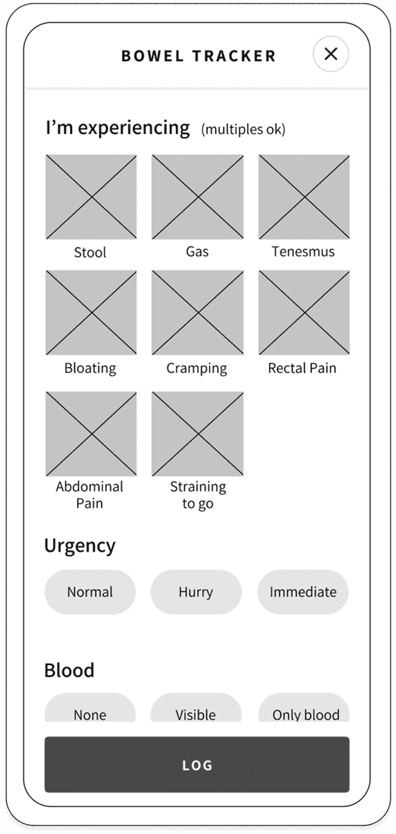
I conducted moderated in-person and remote usability tests using direct and scenario-based tasks to evaluate key features: adding doctor appointment reminders, tracking bowel movements, managing prescriptions, and exploring new exercises. In-person A/B testing was also used to assess the primary navigation.
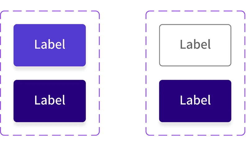
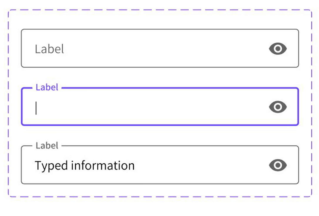
Design Language System
Mission Statement
Logo
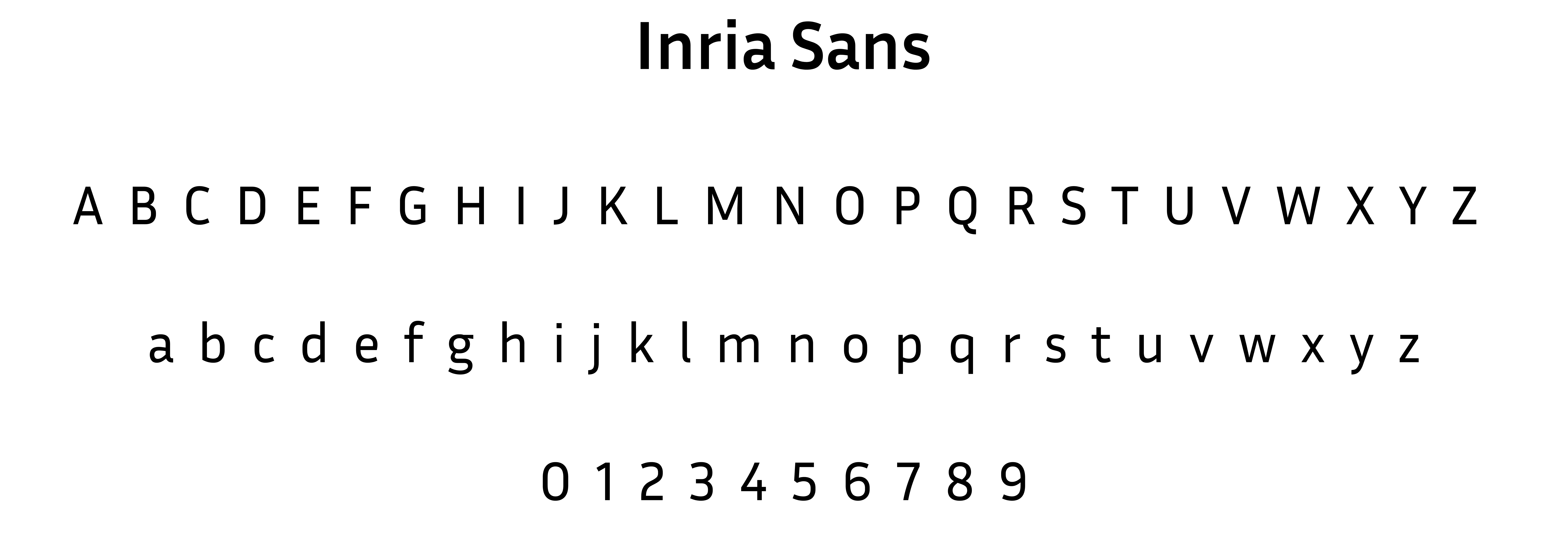
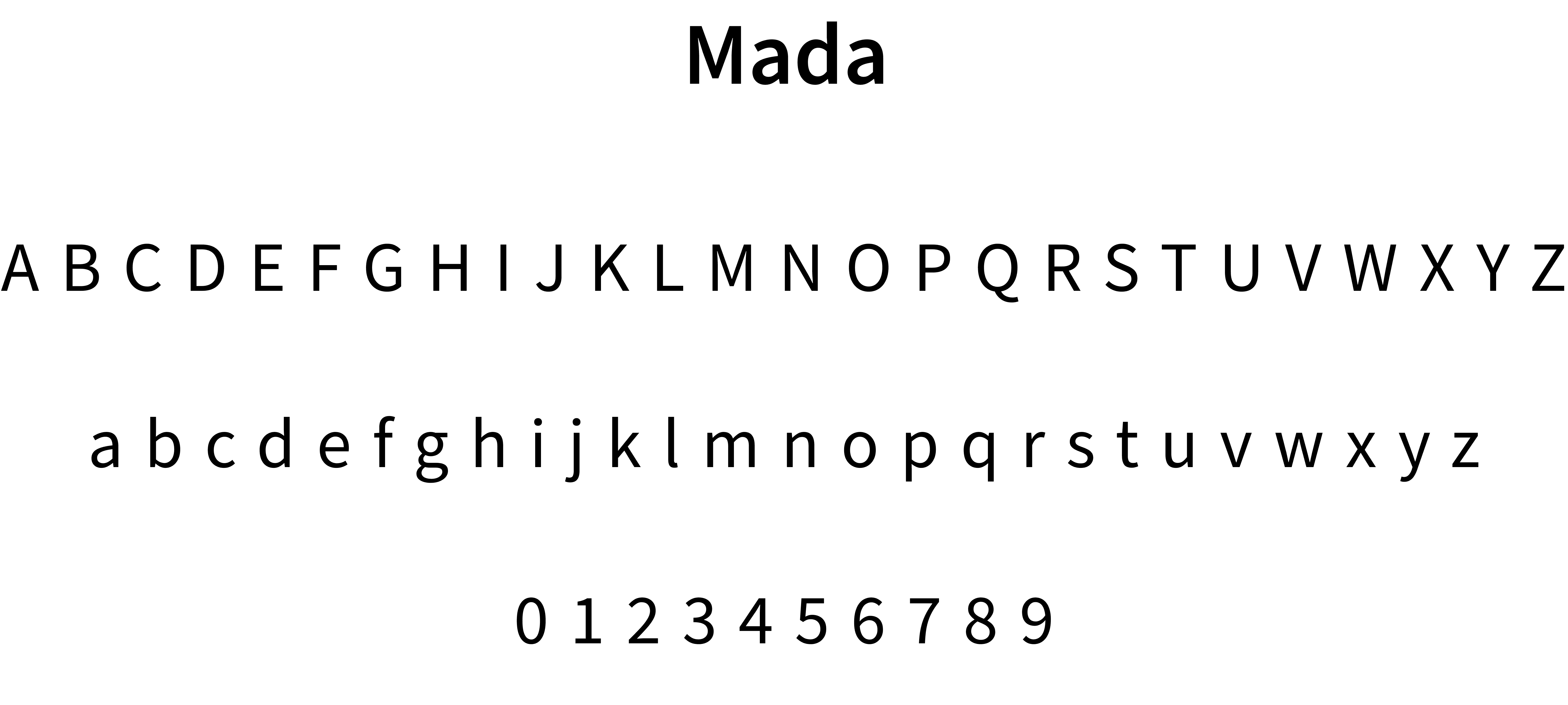
Typography
Colors
Grids
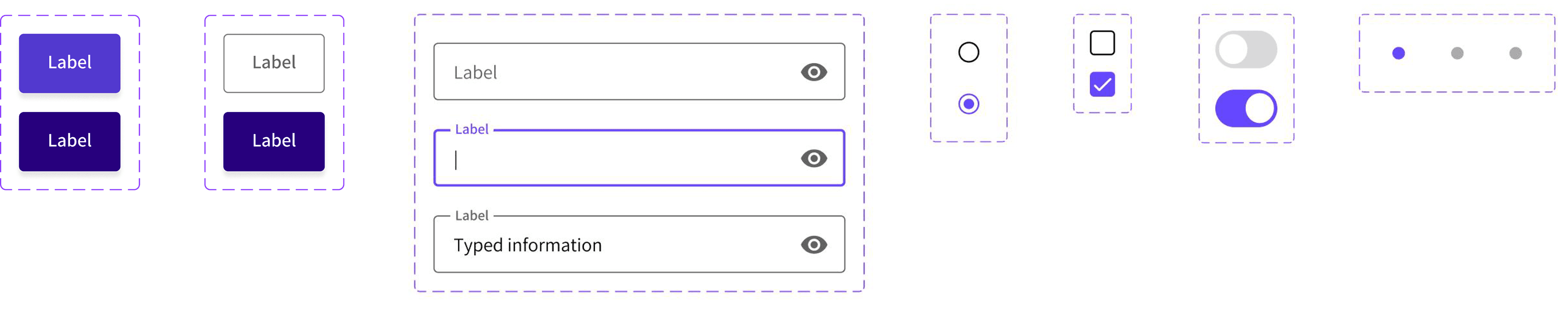
UI Components
Interactions
Animations
Tagline and Voice
Mascot
An excerpt from the design language system is displayed below.
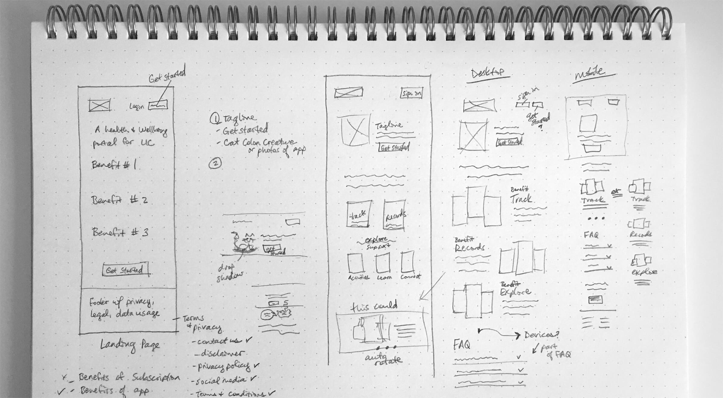
Low-fidelity Wireframes
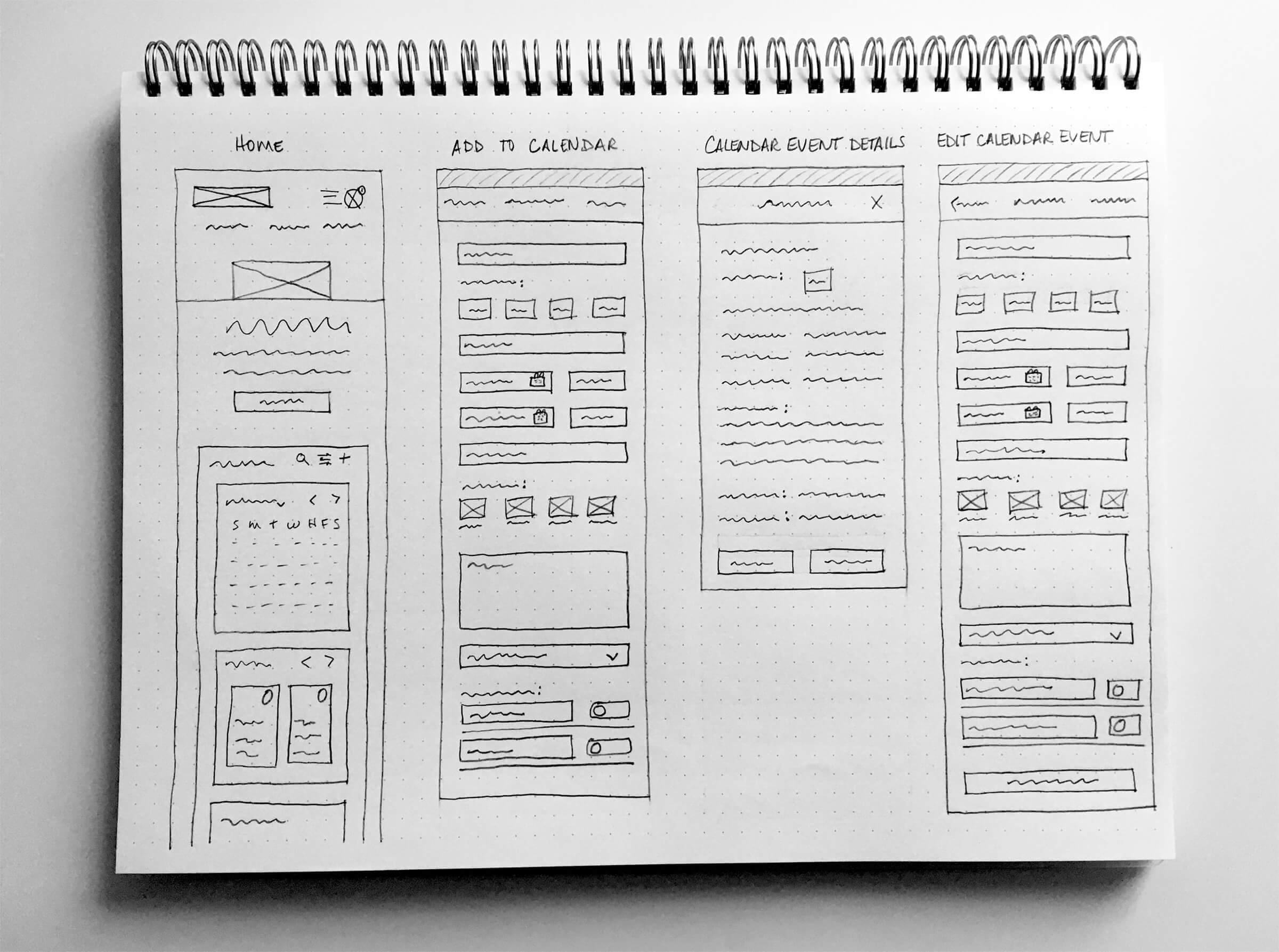
Mid-fidelity Wireframes
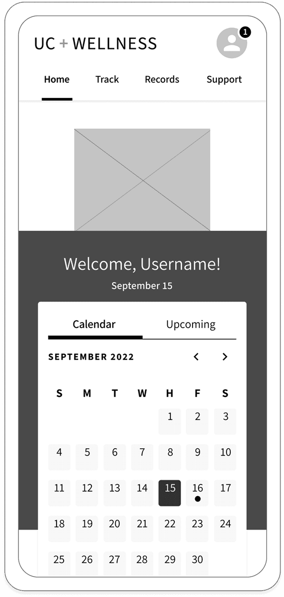
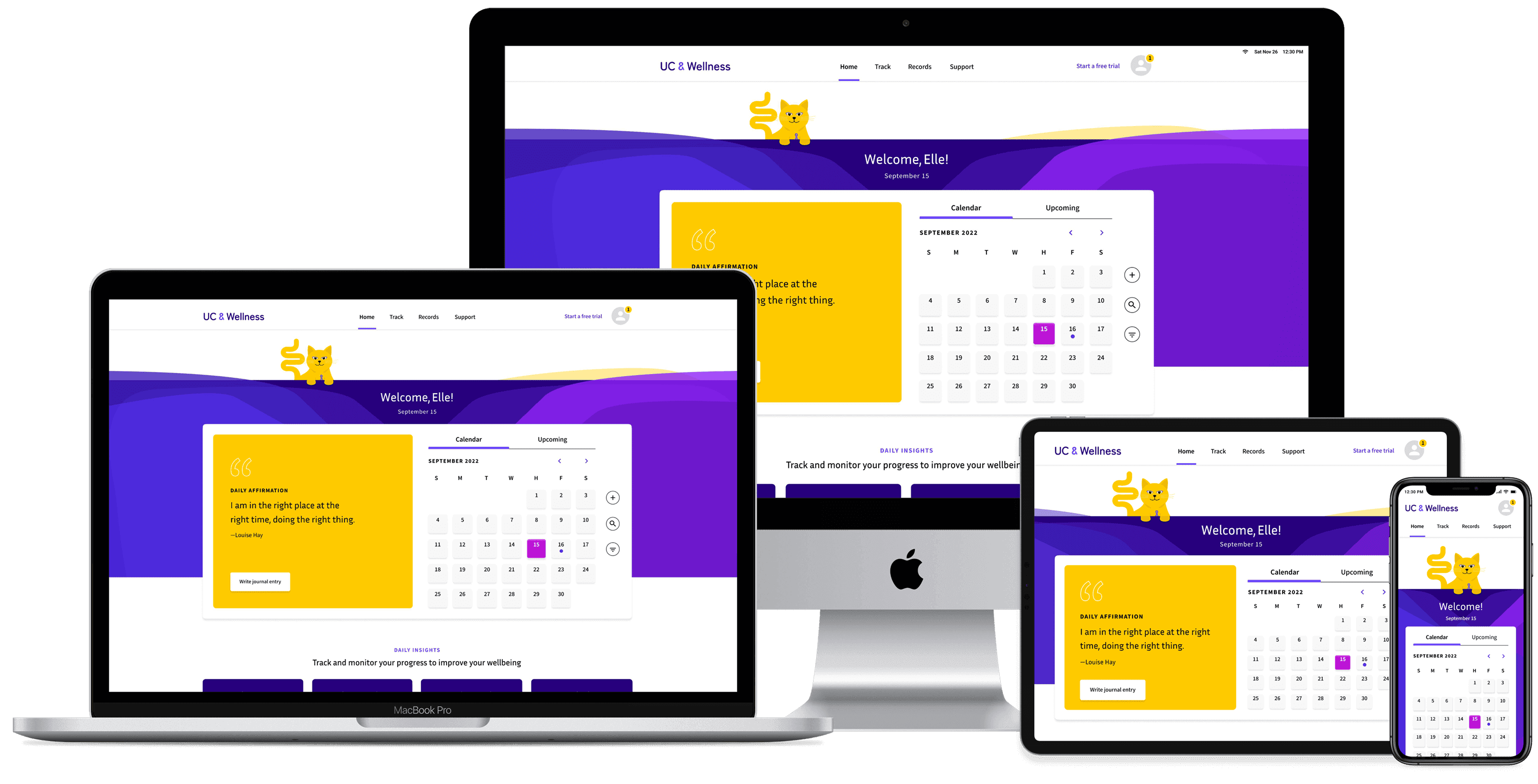
Home Screen Improvements
Improvements included: a way to return home and updated navigation. More testing and iterations followed, and the site map and user flows were updated to reflect those changes.
The biggest challenge was balancing content—keeping the mobile design clean while making the desktop layout feel full. Clear, concise organization based on user feedback helped me achieve this. If starting over, I’d refine the calendar placement to bring more content above the fold and I would dial back a few of the colors to keep the emphasis on purple. Next, I’d test the prototype again to ensure the latest revisions resonate with users.
Typography
Iconography
Common UI Components
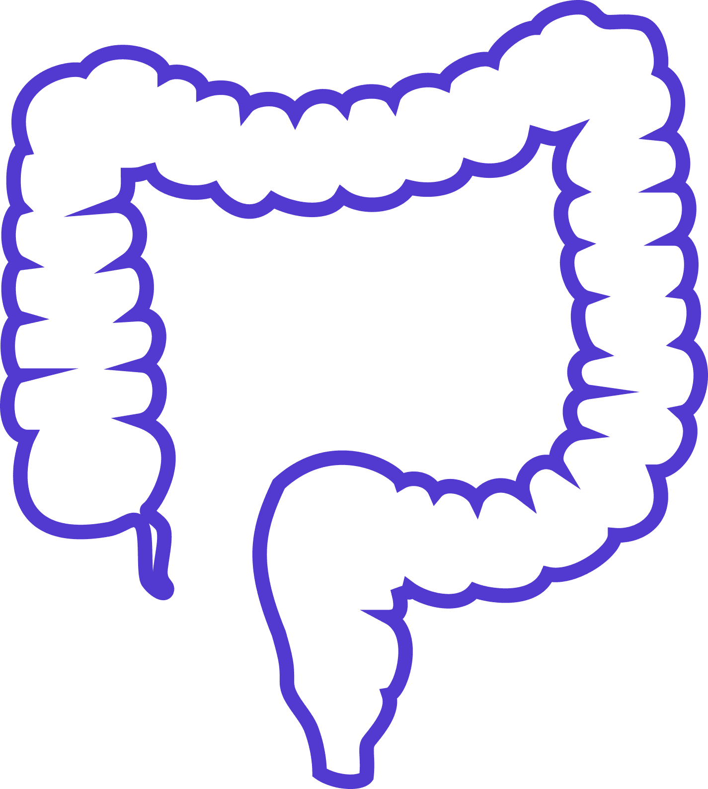
Organic Shapes
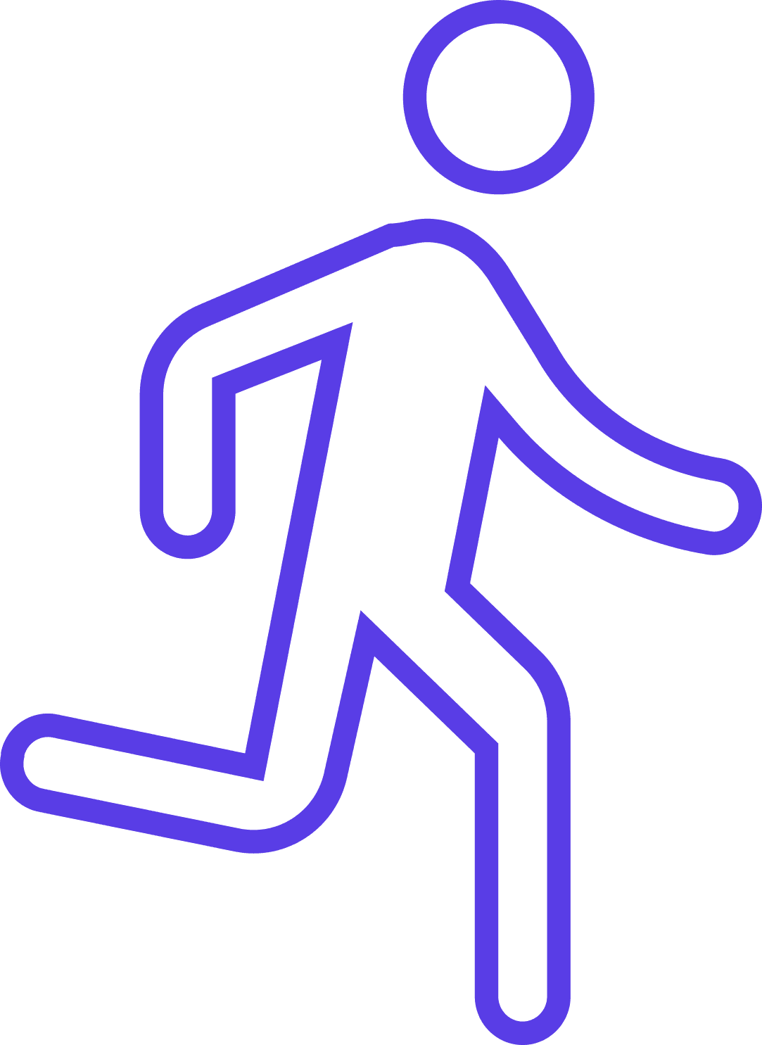
Rather than relying on photos, which can be challenging for depicting ulcerative colitis, the app uses organic forms symbolizing the colon’s structure—the tissue and tunneling of the colon.
Overview
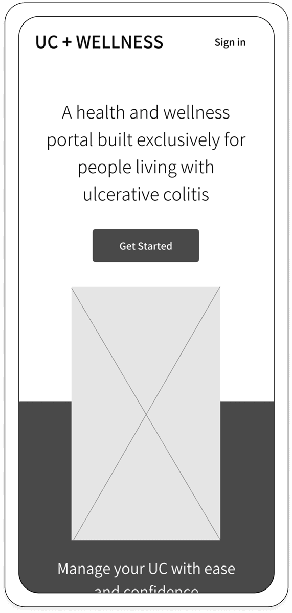
I designed a responsive health and wellness portal tailored for individuals with ulcerative colitis (UC), equipping them with the tools to confidently manage their condition and navigate the path to clinical remission. My design process and the case study are outlined below.
PROJECT TYPE
Responsive Web App
PRIMARY TOOLS
Figma, Optimal Workshop, Photoshop, Illustrator
RESEARCH
I defined my research goals and methods, and performed user research to empathize with users and better understand behaviors, needs, motivations, and pain points. Highlights from my research are below.
SYNTHESIZE
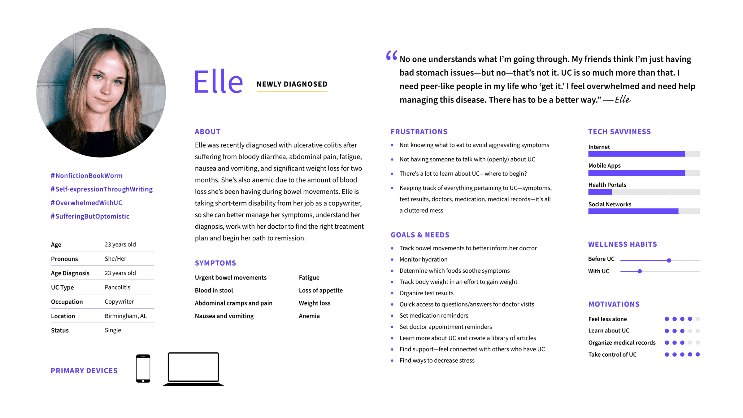
Based on my research findings, I created three personas, all at different stages of their journey with ulcerative colitis. One example is below. Additionally, I developed a problem statement.
Based on my research findings,
I created three personas, all at different stages of their journey with ulcerative colitis. One example is below. Additionally, I developed a problem statement.
STRATEGY
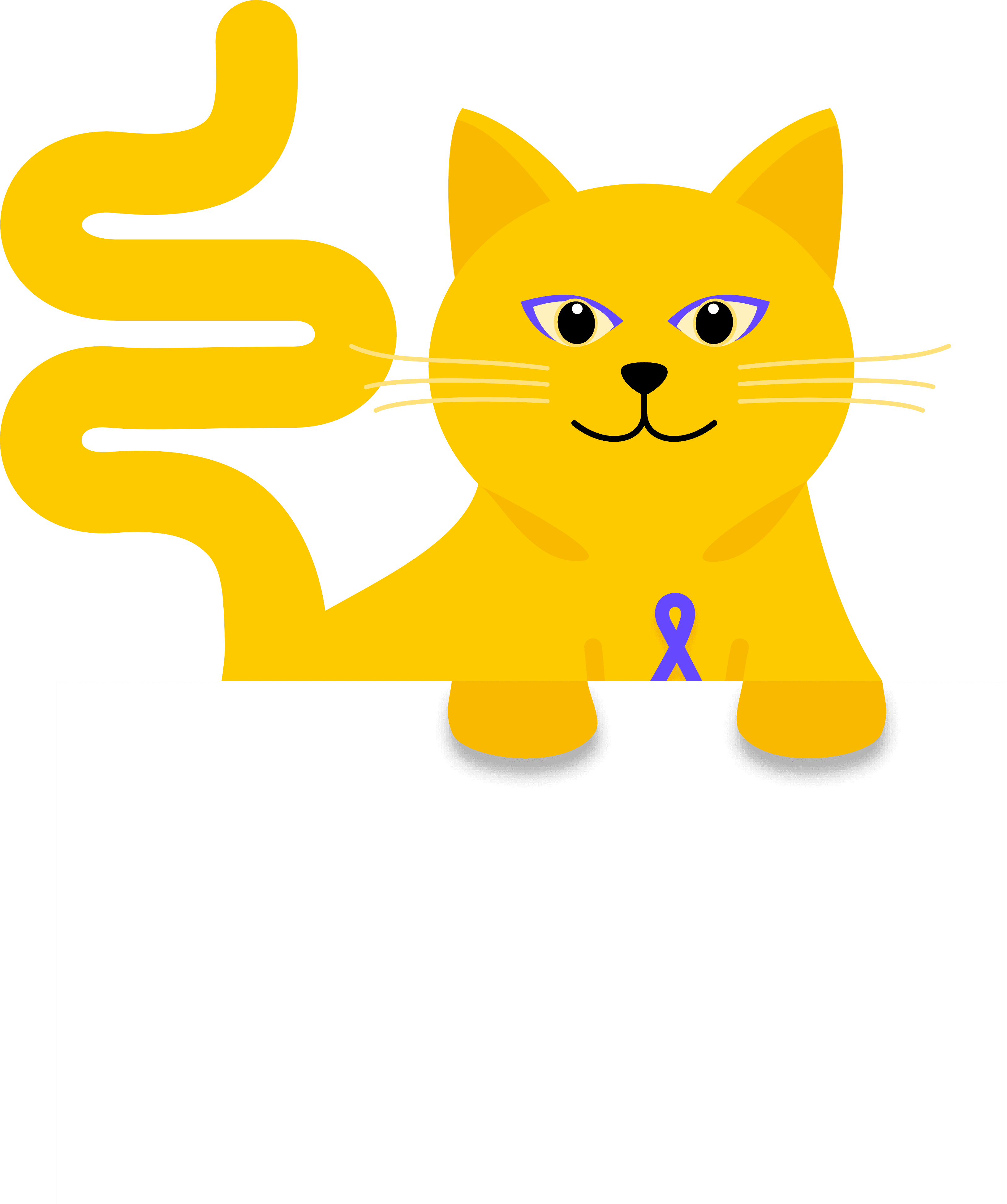
To foster an emotional connection and enhance user engagement, I introduced Coco the Colon Cat—an animated mascot designed to support and guide those navigating ulcerative colitis with warmth and understanding.
To foster an emotional connection and enhance user engagement, I introduced Coco the Colon Cat—an animated mascot designed to support and guide those navigating
ulcerative colitis with warmth and understanding.
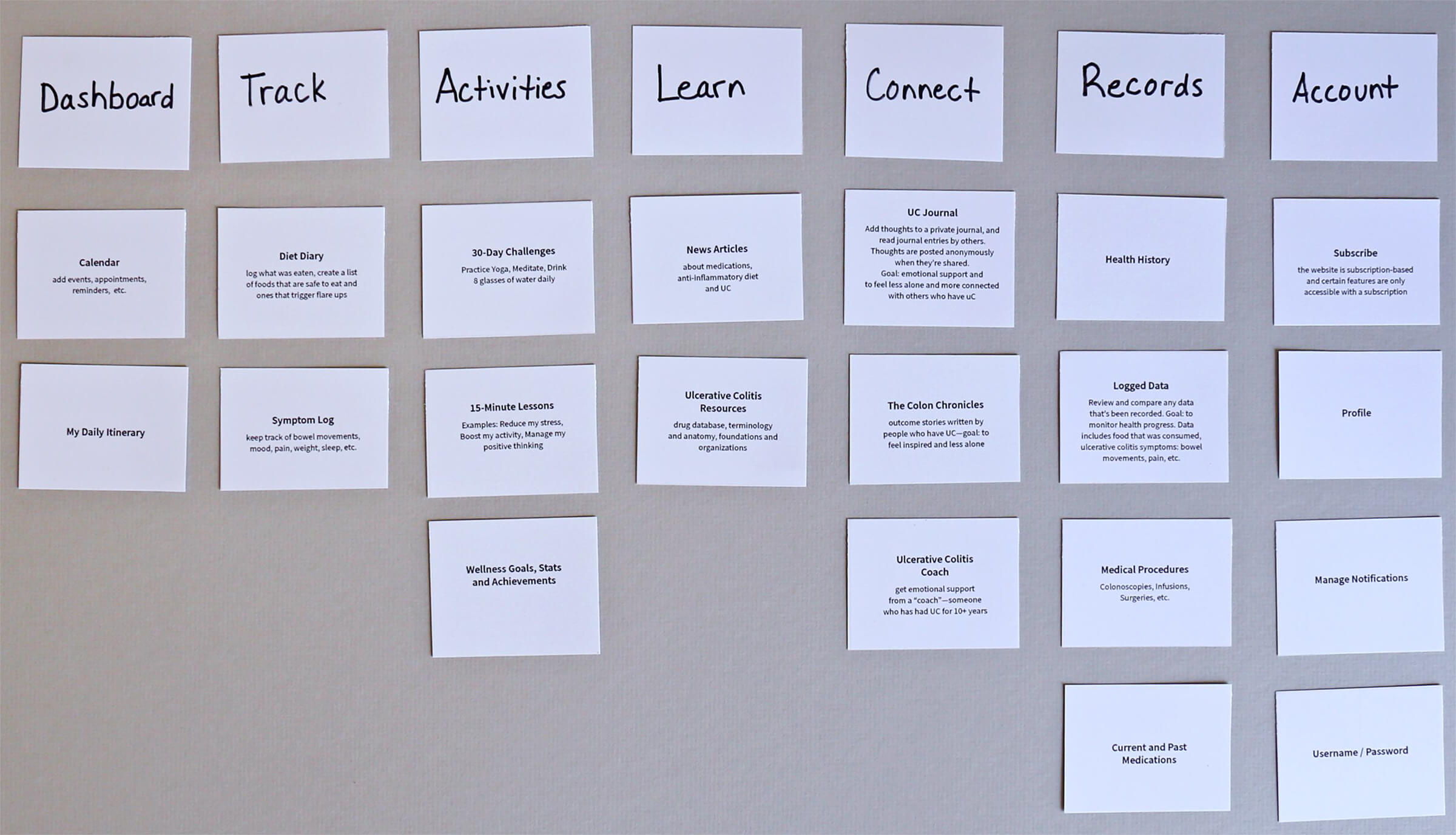
ARCHITECT
I sketched concepts and iterations based on research data and emotional strategy. I then refined these ideas into a potential design solution, using card sorting to develop the site plan and organize the app’s structure.
DESIGN
I brought the site map to life, starting with hand-drawn, low-fidelity wireframes, and progressed to mid-fidelity wireframes and interactive prototypes using Figma.
USABILITY TESTING
The usability study aimed to evaluate the app's learnability, gauge the app's value, assess users' comprehension of the project, and determine users' ability to successfully complete specific tasks.
DESIGN SYSTEM
Vibrant, clean, simple, thoughtful, friendly, and helpful are just a few of the words that shape the voice, tone, and feel of the design language system.
Coco’s animation sets the tone of the app. From getting rolled with toilet paper, to his subtle tail movements and slow blinks, his humor, compassion and friendliness lighten and lift the user experience.
The polished design exudes vibrancy and positivity, and it’s tailored to support users at any stage of their journey with ulcerative colitis, reflecting a holistic approach.
WALKTHROUGH
Experience a walkthrough of the UC and Wellness app! This prototype walks through three tasks that fulfill the needs and goals of our persona, Elle.
UC and Wellness, Responsive Web App
UC and Wellness
Responsive Web App
People who have ulcerative colitis need a way to simplify and manage their health and wellbeing because they want to feel in control of their disease, their overall health, and empowered to reach (or sustain) clinical remission. We will know this to be true when we see that people with ulcerative colitis are able to successfully track their symptoms and progress, better understand their disease, and are able to provide detailed information to their doctors—all of which guides them to reach (or sustain) clinical remission and live confident, fuller lives.
Ideation
Card Sorting Sessions
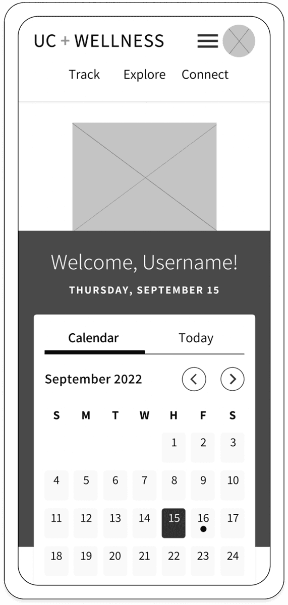
I conducted unmoderated open card sorting sessions and a moderated closed card sorting session. The sessions identified ways to cluster information for a streamlined site map, and solidified the app’s three primary benefits—track, explore, and connect.
This initial site map was implemented for the first round of usability testing. After testing, the map was modified to incorporate user feedback.
Site Map
This initial site map was implemented for the first round of usability testing. After testing, the map was modified to incorporate user feedback.
Site Map
This initial site map was implemented for the first round of usability testing. After testing, the map was modified to incorporate user feedback.
Site Map
Mobile, High-fidelity Designs
Feedback was evaluated using Jakob Nielsen’s scale and documented on a rainbow spreadsheet. Based on this information, I created a usability test report and modified the prototype.
To efficiently track feedback, participants were color-coded, and an affinity map was used to categorize errors, positives, negatives, and observations. Selected feedback is shown below.
“Explore means to explore all the different features within the app.”
“It’s nice because in literally one or two clicks, I’m finding out the stuff that I need.”
“I’m not overwhelmed with a bunch of stuff on the screen that I don’t understand.”
I conducted moderated in-person and remote usability tests using direct and scenario-based tasks to evaluate key features: adding doctor appointment reminders, tracking bowel movements, managing prescriptions, and exploring new exercises. In-person A/B testing was also used to assess the primary navigation.
Research Methods
Research Insights
Include symptom and diet trackers for a holistic approach to managing UC.
Centralize health records and medication/doctor appointment reminders.
Privacy and security are essential for user trust.
Self-care and tracking progress with overall wellness is valued.
Connecting with others who have UC provides support and understanding.
When UC is managed, focus shifts to resources on treatments and related conditions.
Understand how users manage life with ulcerative colitis
Learn how users keep track of symptoms and medical information
Determine the wellness activities that would be most beneficial for users
Identify features users find most helpful in a health/wellness app
Feedback was evaluated using Jakob Nielsen’s scale and documented on a rainbow spreadsheet. Based on this information, I created a usability test report and modified the prototype.
To efficiently track feedback, participants were color-coded, and an affinity map was used to categorize errors, positives, negatives, and observations. Selected feedback is shown below.
“Explore means to explore all the different features within the app.”
“It’s nice because in literally one or two clicks, I’m finding out the stuff that I need.”
“I’m not overwhelmed with a bunch of stuff on the screen that I don’t understand.”
I conducted moderated in-person and remote usability tests using direct and scenario-based tasks to evaluate key features: adding doctor appointment reminders, tracking bowel movements, managing prescriptions, and exploring new exercises. In-person A/B testing was also used to assess the primary navigation.
Include symptom and diet trackers for a holistic approach to managing UC.
Centralize health records, medication and doctor appointment reminders.
Privacy and security are essential for user trust.
Self-care and tracking progress with overall wellness is valued.
Connecting with others who have UC provides support and understanding.
When UC is managed, focus shifts to resources on treatments and related conditions.
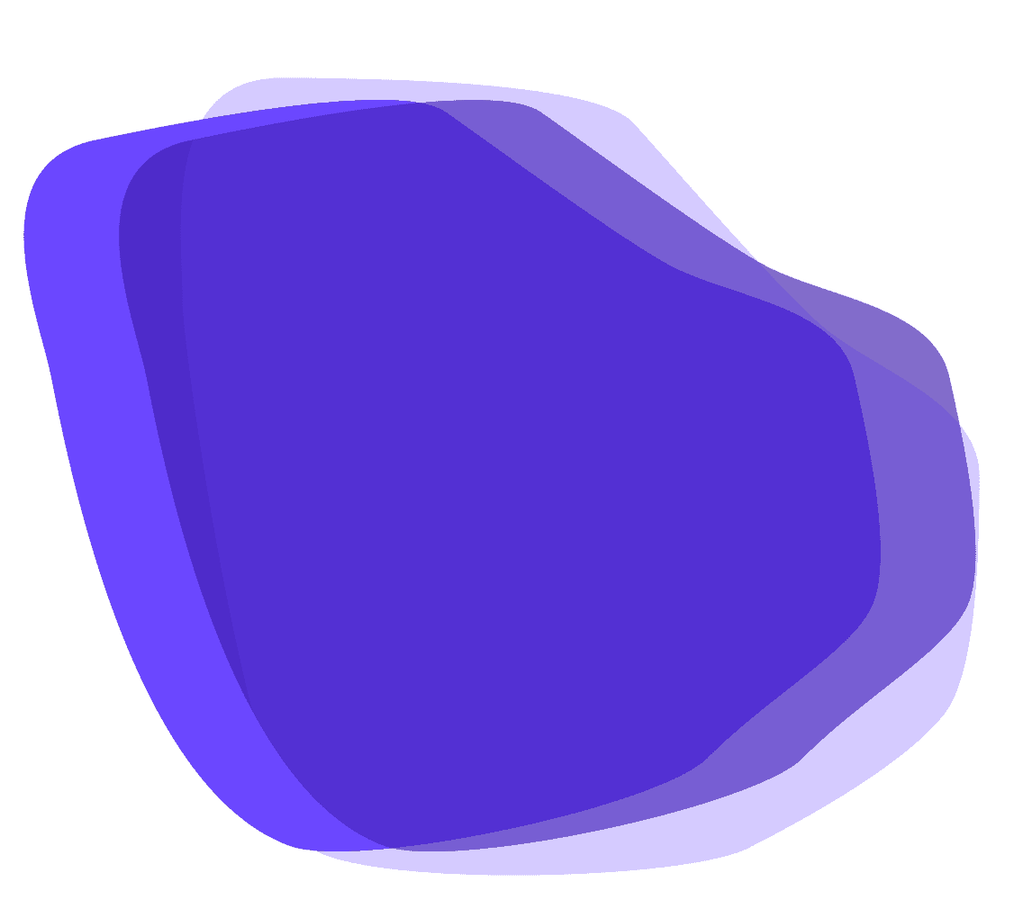
Purple was selected as the primary color because it represents the disease of ulcerative colitis.
Color Palette
Home Screen Improvements
Improvements included: a way to return home and updated navigation. More testing and iterations followed, and the site map and user flows were updated to reflect those changes.
“Explore means to explore all the different features within the app.”
“It’s nice because in literally one or two clicks, I’m finding out the stuff that I need.”
“I’m not overwhelmed with a bunch of stuff on the screen that I don’t understand.”
To efficiently track feedback, participants were color-coded, and an affinity map was used to categorize errors, positives, negatives, and observations. Selected feedback is shown below.
Feedback was evaluated using Jakob Nielsen’s scale and documented on a rainbow spreadsheet. Based on this information, I created a usability test report and modified the prototype.
Findings
Insights